100 Day UI Challenge
Back in 2016 I started the 100 Day UI Design Challenge because I wanted to do some visual exercises to polish my aesthetic skills and become faster, but at the end I realised that I learned much more. As Forrest Gump’s mama always said, it was “…like a box of chocolates.” I didn’t know what I was gonna get. 😀
Project overview
The 100 Day UI Challenge was created by Paul Flavius Nechita in 2015. Since then, it became a movement: lots of designers decide to face the challenge just for fun or to improve their skills.
The challenge is about creating a piece of user interface every day for a hundred consecutive days — even at weekends and on holidays. Each day's topic is given by Paul, but everyone is supposed to design something unique that is somehow different from the ones that are created by other participants.
I started the challenge in the end of August 2016 and finished it later that year in December. Of course there were some days when I struggled with designing something, but altogether I enjoyed it very much and would encourage anyone to do it.
What I gained
1. How to do a quick UI research
Since I had only one day to design something I had to figure out a pattern to collect ideas. So, every day, I downloaded and went through a lot of applications that may apply solutions related to the daily topic.
Also, I searched for app concepts and unique interfaces on Dribbble, Behance and UpLabs to see how others would solve different kinds of design problems. I took screenshots of the downloaded apps, and saved all the interesting designs/links related to the topics.
By the end of the challenge I realised that I had a pretty nice collection of dashboards, sidebars, landing pages, list elements etc. that I could use as an inspiration if I had to design something like these in a real project.
2. Time management skills
So, you have to deliver a design every day for 100 days, which can be challenging if you have a full-time job. Not to mention that you are committed to work even at weekends and on your days off, so you have to learn how to manage your time properly.
My tactics consisted of three phases:
Browsing the Internet to find some inspiration – in the morning from bed and while commuting,
thinking about how my design would look like and how it could be unique (forcing myself to have at least 2 or 3 different ideas) – during the day, mainly on my lunch break,
creating the final design (in Sketch & sometimes animate it in Principle) – in the evening.
Thanks to the time pressure I have learned how to focus on the really important things. I followed this pattern to be as fast as possible.
3. Improved the quality of my design
I learned new design patterns and tried uncommon solutions, played around with typography, paddings, margins, colours, etc. I believe that you can get better by experimenting. During this design challenge I had the opportunity to work on some really interesting concepts. 🎉
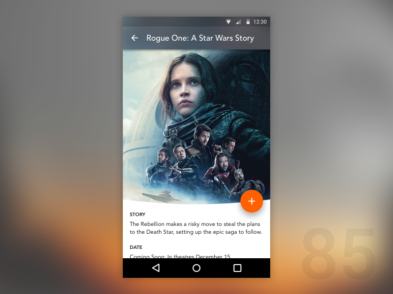
Experimenting with a blurred app bar and a bended image (Day 85 — Cinema Application)
4. Got familiar with new tools
Before starting the challenge, I had mainly used Photoshop and Illustrator, because the clients or the developers required it for some reason. Of course I knew Sketch and Principle, but I never really got to work with them for a longer period. That’s why I decided to complete the challenge with using only tools that I’m not so familiar with.
Completing the challenge was a great way to learn new design apps, that actually made my workflow much faster and encouraged me to use them in real client projects as well.
5. Learned from my mistakes
I believe that receiving feedback is the most important part of the challenge, as you can get a lot of different ideas and learn from your mistakes. Therefore, I uploaded my screens to Dribble — when I finally got my invitation 🏀 — every day, but I didn’t really get any useful feedback on these platforms: that’s why I decided to organise weekly feedback sessions where I asked for my colleagues’ opinions.
On day 9, for example, I created this recipe app screen. Based on the feedback I got, I noticed that the labels on the tags are barely readable. I realised that I have to learn about readability and contrast, so I dug deeper and read a bunch of useful articles. I learned how the web became unreadable and read about color vs. contrast. Also, I learned a lot about web accessibility and found a really cool color contrast checker tool.
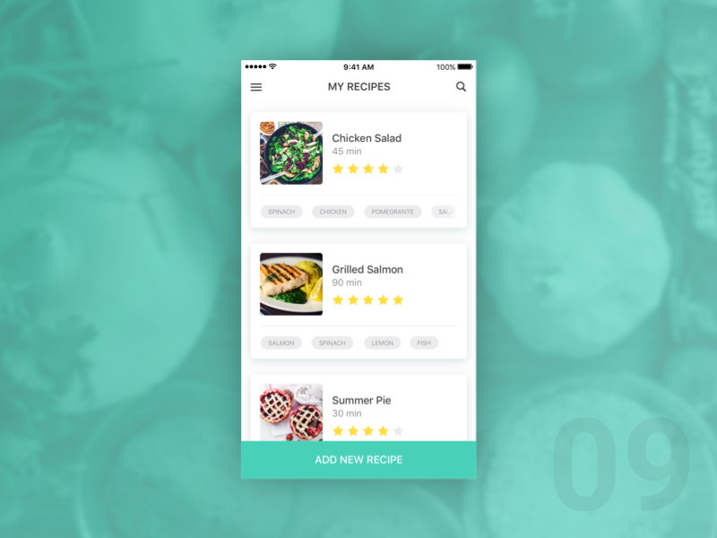
Contrast problems with one of my designs (Day 9 — Recipe App)
6. Had a lot of fun
If you like experimenting, learning new things and working on out-of-the-box solutions, you would definitely enjoy completing a challenge like this.
Here is an example of an animation that I really liked working on.
An exciting experiment made with Principle (Day 79 — Sidebar Animation)
Limitations
As a designer a very wide skill set is required to deal with real projects, but the skills that I managed to improve by this challenge definitely are a part of the package. However, not everything can be learned by completing a challenge like this.
Usability isues
On day 37 I created this file storage widget, and asked a bunch of people what they thought about it.
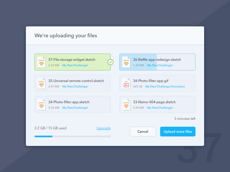
A nice user interface doesn’t necessarily provide a good user experience (Day 37 — File Storage Widget)
It turned out that the small blue bar in the bottom left corner seemed to be a progress bar, that showed the upload status, however, my intent with it was to show how much free space you’ve got left. I realised that it was a usability issue, and if it had been a real project, I would probably had to make changes on the UI, and test it again to make it work.
A nice user interface does not necessarily provide a good user experience. User testing in many iterations is a must-have part of creating a great application. Of course designing an out-of-context screen and showing it to some of your friends (like I did here) would never teach you how to create an application for a real client. It simply lacks the steps of a decent UX process.
Distracting animations
Let me give you another example. On day 34 I was playing around with Principle and wanted to create something exciting. I ended up with creating this animation:
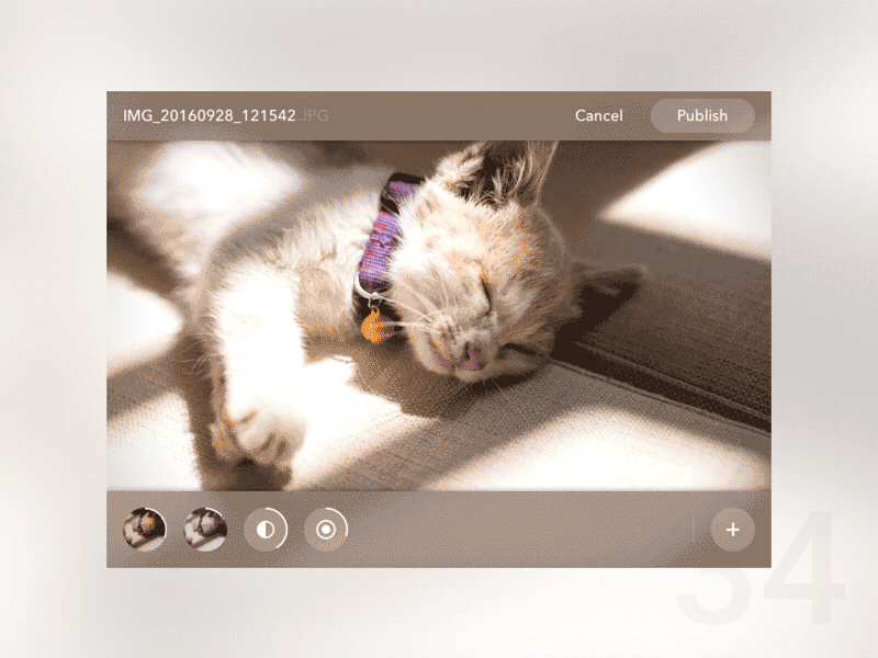
Be careful with animations (Day 34 — Photo Filter App)
Soon I started to think if it would work in a real project: the combination of these interaction animations (bouncing and moving elements) might be just too much. It‘s one thing that it looks nice, but would people understand what’s happening? Well, I'm not so sure.
Takeaways
Completing this design challenge was not only about improving ymy designs’ quality, but was also a huge commitment. It helped me improve my time management skills, I learned new design patterns, got to know the best practices, learned new tools, and of course had fun.
The beauty of it is that I was allowed to make mistakes. I think it was a great way to receive feedback and hypothesize what the problems could be with my designs in real scenarios. I think it helped me notice problems easier in my client projects.
If you’d like to know more about how I faced this challenge and see all the designs, you can find it all on my Dribbble page.
Thank you for reading!