Idax.pro
If you don't feel like reading 🙃
In July 2018 I got a new project at UXstudio: my team was tasked with redesigning Idax, a cryptocurrency exchange and trading platform. It sounded really exciting, especially because at that time I didn’t really know a thing about cryptocurrencies. What made it even more challenging was that we were to work together with them remotely, but most people from their team didn’t speak English.
Introduction
My role
Being the one with the most experience, I got to lead our team of five. We had two researchers, two designers (including me) and one front-end developer from UXstudio. As a team lead I was responsible for putting together the timeline, identifying potential blockers and ensuring everyone knew what they had to do throughout the project. I also made sure that communication between teams was as smooth as possible and paid special attention to deadlines and deliverables.
Scope
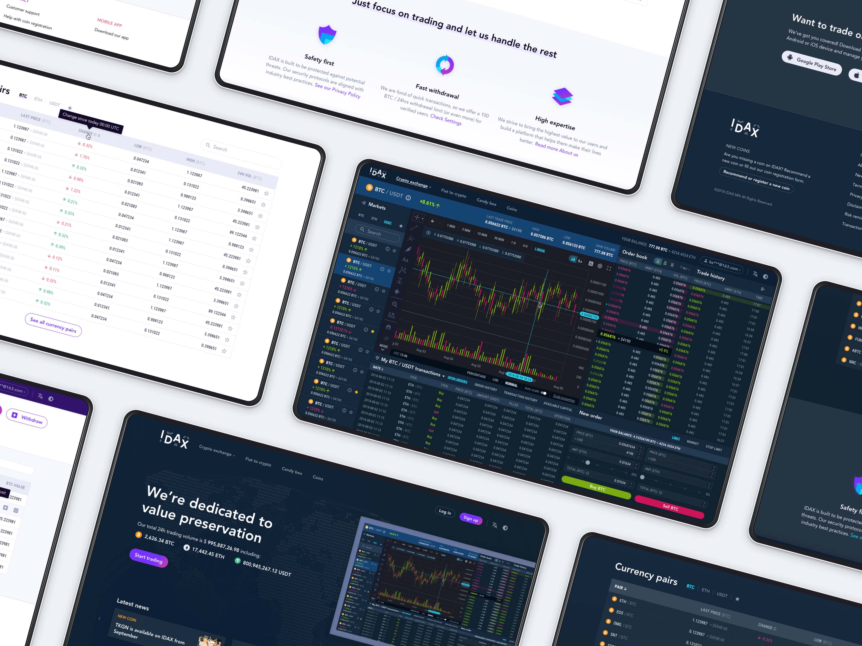
At that time Idax already had a website with a decent amount of active users but they weren’t satisfied because the platform had many usability issues and inconsistencies. Also, it was only available for desktop users. The team wanted to make it even more appealing to the international audience by fixing the flaws and making it look & feel more professional, secure and reliable.
Screenshots of Idax.pro before the redesign
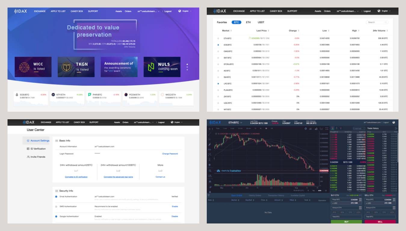
In eight weeks we redesigned Idax.pro and created a more intuitive and consistent platform, accessible for both tablet and desktop users.
Design process
Before kicking off the project I had started learning about cryptocurrencies, so when it came to the first meetings, at least I didn’t feel completely lost.
In the exploration phase, we had three days full of workshops and user interviews together with the Idax team. At these kickoff meetings, we learned a lot about the industry, the competitors, the target audience and the product itself.
After kicking off the project, we carried out an expert evaluation on the live website to identify potential flaws. We also conducted usability tests with both professional and hobby traders to gain more insights.
Then, together with Martina, the other designer, we ran “quick and dirty sketching sessions” and designed wireframes on paper.
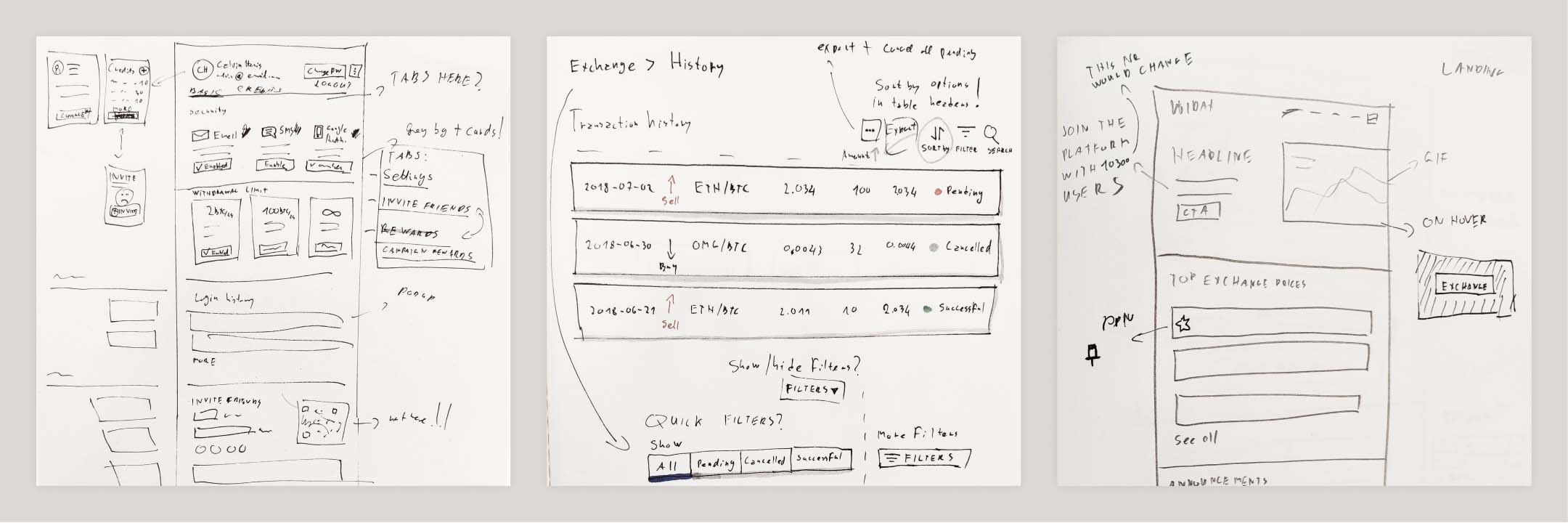
Quick and dirty wireframes
People who we had interviews/tests with, told us that many trading sites’ structure and navigation are fairly similar to each other which they found extremely useful.
“I’m using five platforms at the same time, I don’t want to have to learn new patterns” - they said. It became clear to us that enabling users to quickly switch between platforms was quite important. We also realized that by paying attention to small details we can make their experience unique.
Because of these findings, we decided to finalize the look & feel as soon as possible and design high-fidelity prototypes with attention to fine details.
After a couple of weeks of prototyping and testing, we ended up with a Sketch file containing one hundred and twenty-three artboards and a complex component library.
We also created eight animations to specify how to make the experience even better, using motion. You can see one of them below.
Redesigned version of the Idax.pro landing page
Challenges
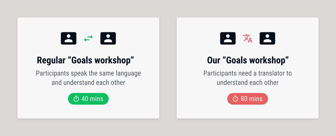
1. Language barrier
At meetings
Communication with the Idax team was extremely challenging since the members of their core project team didn’t speak English. So, for each meeting we had together, we had to invite a translator.
When putting together the agenda of the kickoff days, for example, we had to pay special attention to the fact that a translator was going to have to translate every sentence to the applicable language. Thus, for each workshop, we decided to calculate 50% more time than usual to tackle the translation time.
As it turned out, having a translator in the process easily doubles the time. After running out of time at the first couple of meetings, we had to readjust the rest of the agenda and make changes on some of the workshops.
Tip: When running a workshop with a translator in the process, expect twice the usual amount of the time that you’d spend on it normally
An example to show how much time a workshop takes with a translator in the process
It was obvious that we needed to come up with a way that helps us communicate better and saves us some time. So, learning from the kickoff workshops and some other remote meetings, I decided to send emails with all the details (decisions, sketches, screens, research insights, etc.) one day before our weekly meetings.
The Idax team translated these emails using Google Translate and read through them. So, when it came to the actual meeting, we could focus on discussing the things that needed further clarification - saving us plenty of time and energy.
In chats and comments
Another language related issue affected our day to day communication, which basically meant chat messages and Zeplin comments. In the beginning, we all wrote in English. For us (the UXstudio team), it was convenient of course, but the Idax team found it quite challenging since they always had to translate both our messages and their own.
It became even more inconvenient when they had to look at messages from the past that they had already forgotten about and had to translate them again to understand the conversation.
After realizing that it was an issue, I started Google translating the messages and comments I was going to send and included them below the English text.
We wrote our Zeplin comments in two languages
The solution was very much welcomed and from then, we all wrote our messages and comments in both languages. Of course, it required a little bit of extra time from us, but saved plenty of time for the Idax team and radically improved our overall communication.
2. Complexity reduction
The initial version of the Exchange page looked chaotic, at least to us. There were just too many things on the screen at the same time. During the initial user tests, even traders mentioned that in some cases the interface made them feel a bit lost and overwhelmed.
So, I decided to reduce the complexity of this page by applying the following changes:
Separated content by using cards and adding extra white space
Hid certain shortcuts (filter orders, change graph type and change time period) and introduced dropdown solutions instead
Combined the sell and buy sections into one and introduced tabs to switch
The initial version (left) and the first iteration (right) of the Exchange feature
As it turned out, it was a bad idea. When testing our first prototype, people complained about having to click too many times to switch between views and to bring up certain features.
Hiding items by default and adding more white space did make the interface look cleaner but was also less effective. People had to spend more time to complete a certain task.
“A few extra clicks can cause a significant amount of time loss, even if it’s just a second or two. When trading, timing is essential, every millisecond counts.”
It became clear that my approach was wrong and I had to find different ways to overcome the problem. I learned that traders have to be able to switch between views and access information as quickly as possible.
So, over the next iterations, I made the following changes:
Re-added all the shortcuts, making it faster to reach certain functionalities
Separated sections better using color tones and introducing section headers (instead of using white space and cards)
Grouped and arranged items that belonged together
Highlighted certain elements using a more prominent color
Improved readability by using colors with more contrast and introducing slightly bigger fonts and line spacing
Introduced more conventional UI patterns that made completing certain tasks easier (e.g. switches and sliders)
Animation showing the initial version and the different iterations
During the following usability test sessions, we received really good feedback. With the above-mentioned changes we enabled users to complete their tasks on the page faster without feeling lost and overwhelmed.
3. Day mode, night mode
We found that many users (especially hobby traders) used exchange platforms like Idax after work. To make it easy on their eyes, we decided to help them a bit by implementing two modes: a day mode and a night mode.
Primary and secondary colors in night mode - we used Stark to check color-contrast ratios
Despite having two color schemes, we only designed the pages in either day or night mode, because we didn’t have enough time to design all the pages in both modes.
Therefore, I created a fairly complex component library to show how colors change when switching to another mode.
A part of the component library
I also created some example pages so we can see how things would look like in both color schemes. I had several ad-hoc feedback sessions with our front-end developer to make sure we follow an approach that’s not going to be super difficult to implement.
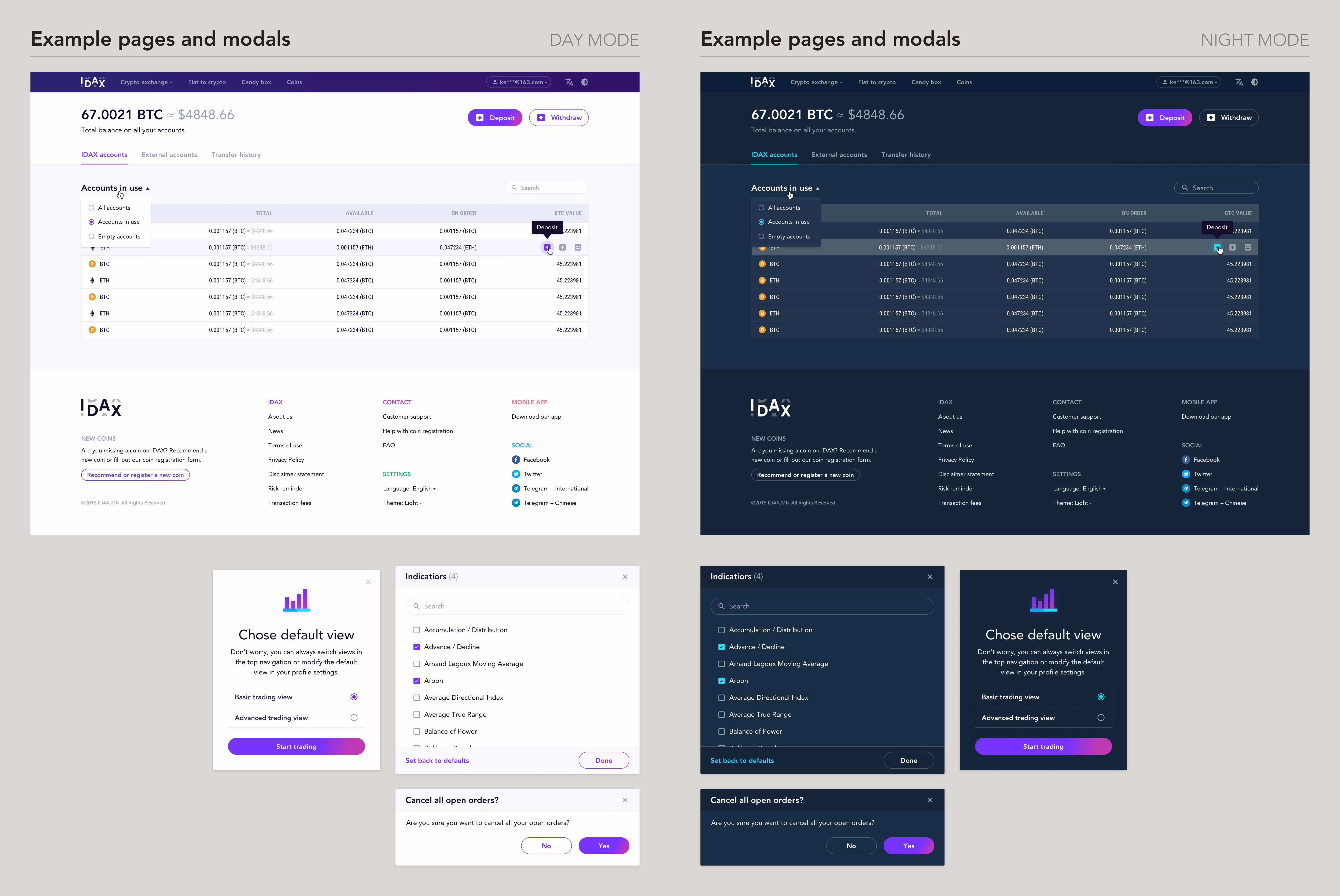
Some example pages showing components in day mode and night mode
Thanks to Bálint, our developer, both modes got implemented and turned out great.
4. Mentoring
As it was brought to my attention before the project, Bence, one of the researchers in my team, wanted to learn more about and get hands-on experience with interaction and visual design. Since we were to start a project together, I asked him if he’d be interested in going the extra mile and participating in the design-related sessions, too. He was thrilled about the idea and more than happy to do so.
I decided to involve him in activities throughout the whole design process. However, I didn’t want to overwhelm him, so I let him decide how much he actually wanted to do.
In the discovery phase, we often discussed problems related to information architecture and talked about how to structure pages. We usually sketched possible solutions together and considered the pros and cons of each. We talked a lot about UI patterns as well.
Later in the process, when we started working on the visuals, I asked him to pick one or two user stories that he’d like to cover. He worked mostly on the Settings and the Invite friends pages. You can see the final results below.
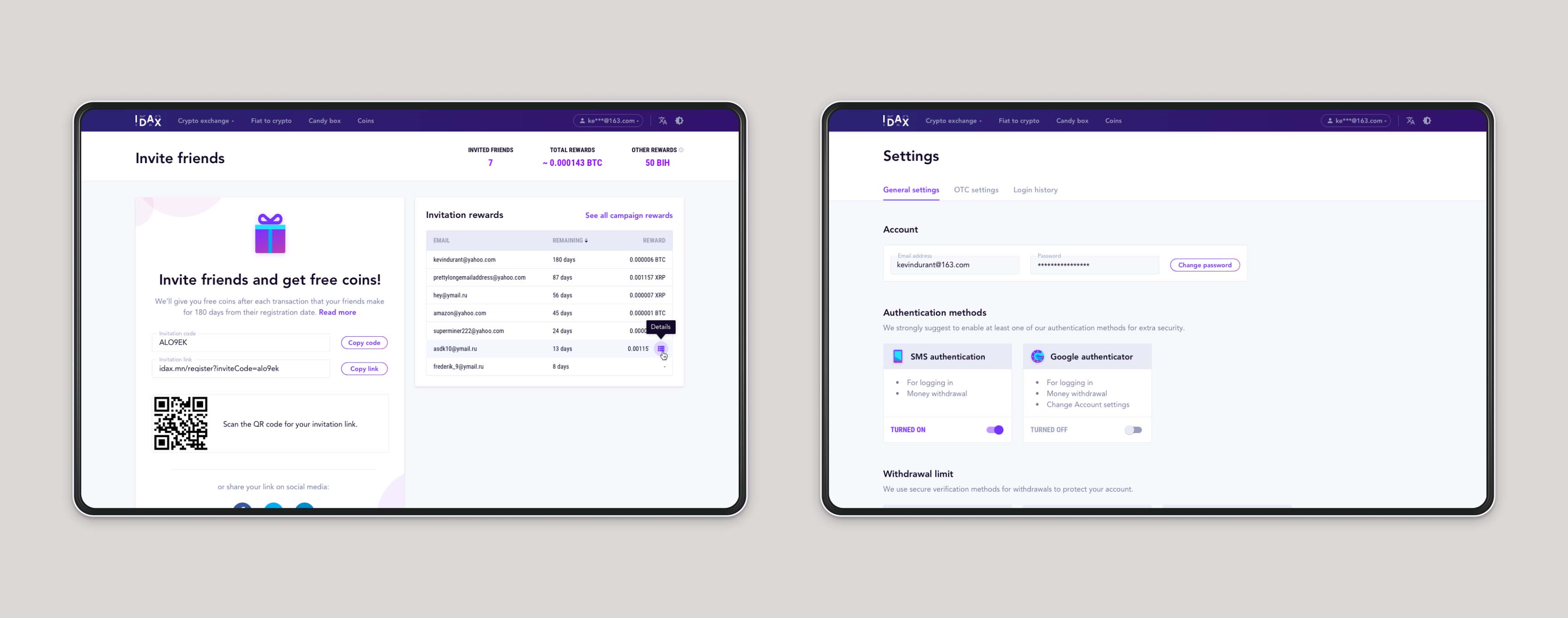
The two pages that Bence, one of the researchers designed
Since we sat right next to each other, it was really easy to answer his questions and give him feedback. I also asked for his feedback on the designs I created.
Although we had scheduled sessions, the ad-hoc meetings proved even more useful, since we could discuss questions right when they arose - keeping us in the flow.
He mostly worked with already existing UI elements (such as icons, text input fields and buttons), but he also created some new components, that turned out great.
I also helped him create his first UI animation: modal window transitions in the “Security settings” user flow.
Bence’s first animation created with Principle App
Helping him took some extra time from my side, but it was an amazing experience. Not just because I could help him improve his skills, but also because I learned a lot as well.
I enjoyed our sessions so much, that I decided to join the mentoring task force at UXstudio right after the Idax project. As a mentor, I was fortunate enough to help two great designers in the first eight weeks of their journeys at the company.
Takeaways
Working on Idax.pro wasn’t always easy, but I feel very lucky because I learned a lot and also had fun while doing so. Thanks to this project I gained insight into the world of cryptocurrencies; I created multiple crypto wallets, traded Etherums and Bitcoins and also bought my very first Crypto Kitty.

My first Crypto Kitty
I always find communicating remotely a bit less convenient than talking to someone in person. This project was especially challenging: we couldn’t be in the same room, and we also had to talk to the Idax team through a translator, which made things even more difficult.
Acknowledging that communication will be slower is definitely a good start in such a situation, but we also need to take action and try to find ways to help each other. Our method wasn’t the best, for sure, but at the end, we managed to find a solution that worked quite well for everyone.
I also learned that reducing complexity is not always such a good idea. Some products are complex, they need to be, and it’s okay, because that’s exactly how they satisfy user needs. But it’s important that people don’t feel overwhelmed while using complex products. Experimenting and listening to user feedback is key to finding the right solution.
Login signup switch animation I created
I learned that getting constant feedback on my designs from a researcher can be really helpful. Researchers have different perspectives on the product and they pay attention to things that a designer wouldn’t necessarily think about. Mentoring Bence was rewarding in many ways. On one hand, I could help him improve his skills, but I also learned a lot from him and got valuable feedback.
Thank you for reading!