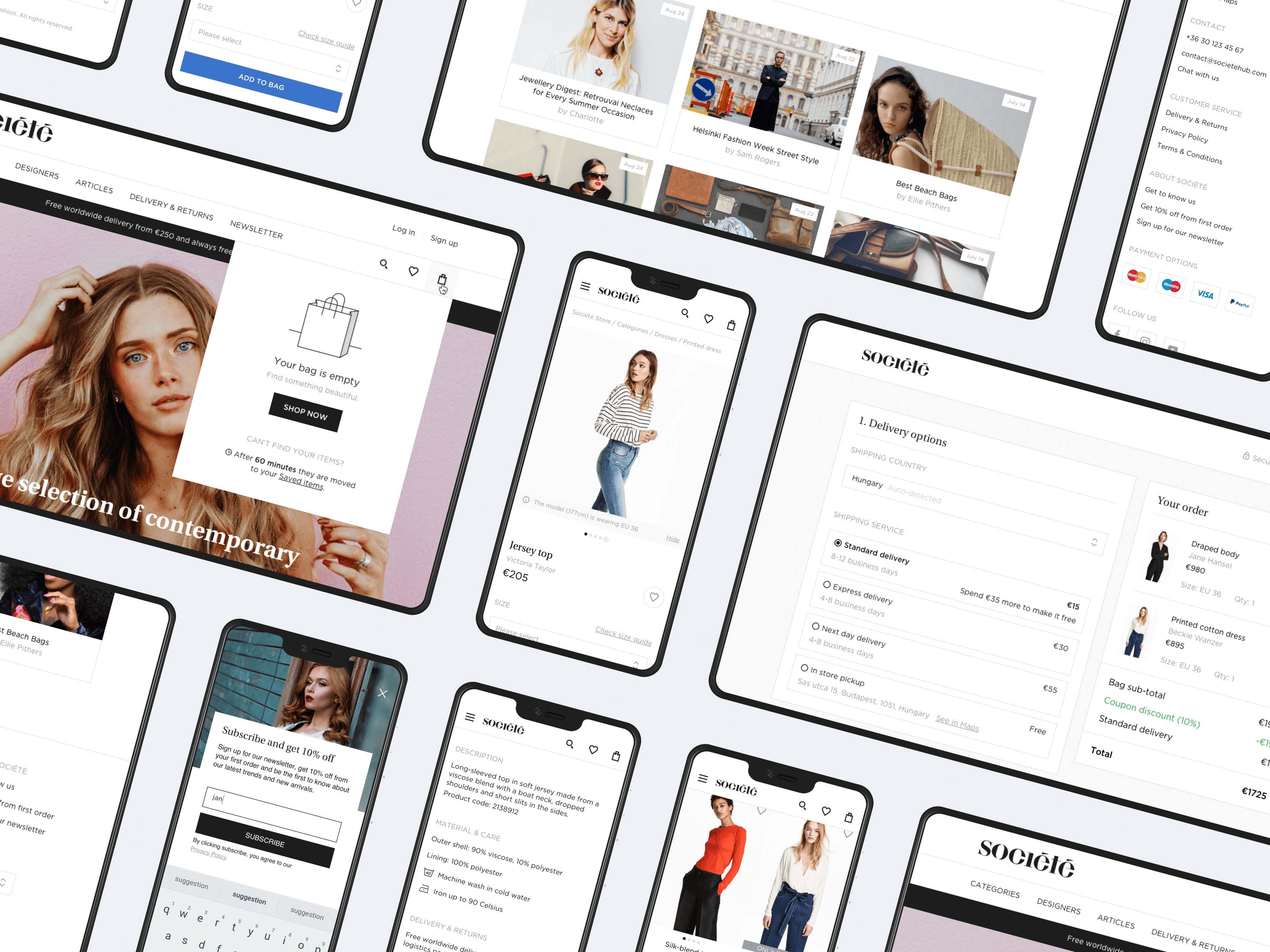
Société Store
As a cultural and fashion movement, Société has a beautiful building that amongst others, gives a place for their physical store. In early 2017, they hired us to design their new e-commerce store where users could browse and buy collections of selected contemporary designer brands online.
Project overview
During the 4 months of the project I worked side by side with a researcher. I was responsible for the design, but also acted as a project manager.
I experimented with a new method called storyframing and created interactive prototypes that were tested in many iterations. While designing the user interface, I paid attention to user needs and the brand characteristics. I also had the chance to improve my copywriting skills while writing the automatic email templates with another colleague of mine.
The client
Société is a Central European cultural and fashion movement. They have a beautiful building (Société House) that gives a place for their physical store, restaurant, many offices and photo/video studios. They also host contemporary fashion, art and gastronomy related events and even have a fashion accelerator program for designers.
My role
At UXstudio we usually work in pairs: a researcher works together with a designer. In this project one of my colleagues, Tímea Falmann, focused more on the research (interviews, personas, card sorting, usability tests), with me mainly on design (user journeys, prototyping, UI design).
I also was a project manager from our side, which means that I was responsible for the communication with the client and the developers, leading the meetings, scheduling, keeping the deadlines and paying special attention to any problems that might occur in the project.
Design process
1. Creating personas
Tímea carried out several interviews with people from the target audience and identified three main personas.
First persona: Bianca👩🎓
She loves fashion and wants to stand out in the crowd. As a young adult, she has to save money to buy designer clothes and accessories. She is price-sensitive but tech-savvy. View persona poster of "Bianca"
Second persona: Lara👩💻
She earns an above-average salary. As a single woman, she wants to express her personality with unique clothes and can afford designer items. Always online, she uses her phone for surfing the internet while on the go. View persona poster of "Lara"
Third persona: Eva👩💼
She is a mature woman, she has her own style but doesn’t always know what to wear. She likes getting help from professionals, so she prefers brick-and-mortar stores. She isn’t particularly tech-savvy, but uses the internet quite often. She has wealth and wants special attention for her money. View persona poster of "Eva"
2. Mapping journeys
Based on what we found out about our personas, I created user journeys to map their assumed experience regarding the online store.
With the help of the journeys, I:
managed to identify and highlight many problems our customers faced at that time,
understood how they interacted with similar websites and what they expected from them,
discovered their pain points and learned more about what they felt at different stages of using an e-commerce store,
identified functional requirements and gathered ideas about how we could solve some of the problems.
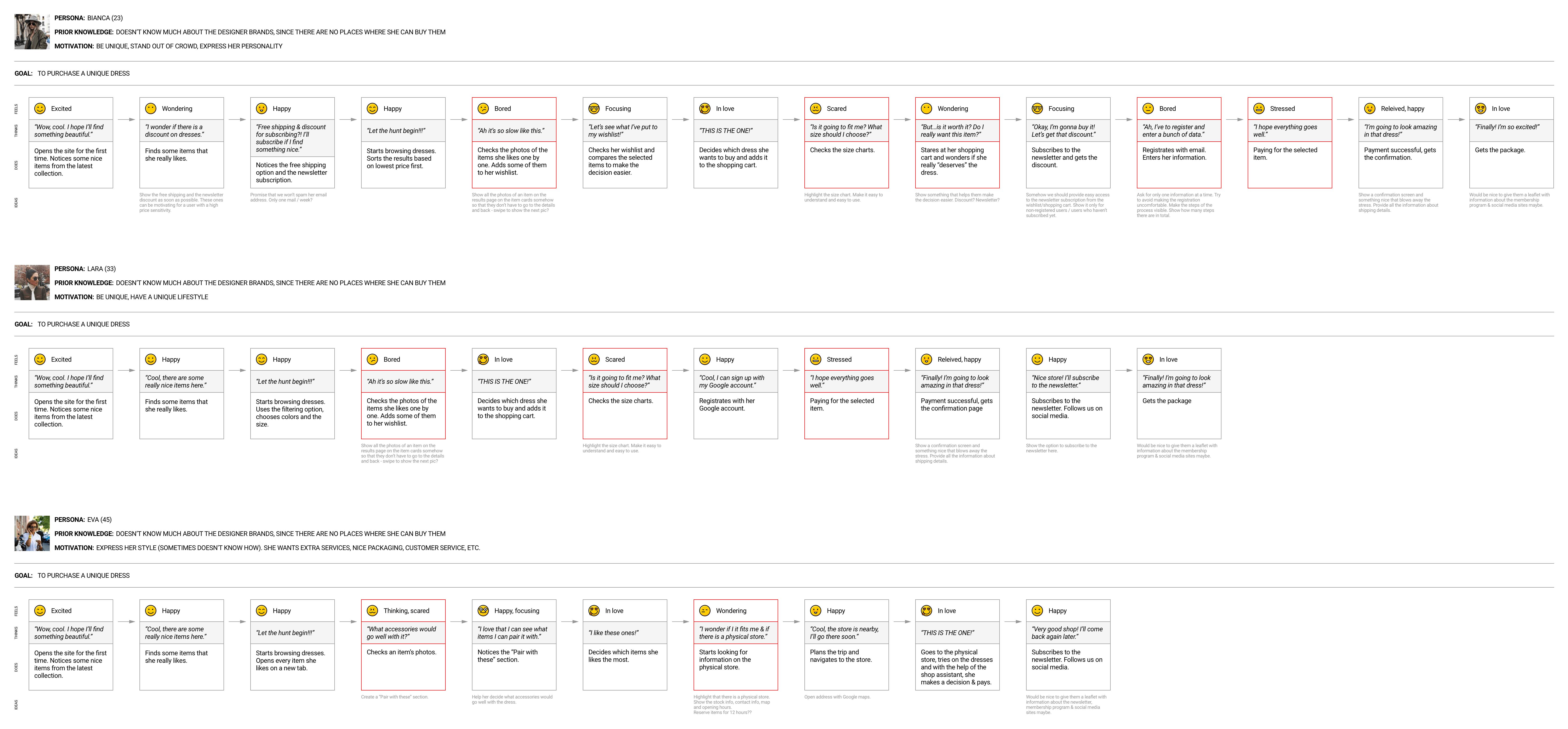
Some of the user journeys - See user journey map in full size
3. Discovering solutions
After organizing all the insights from the exploration phase, we started discovering UI solutions for our personas' problems. For this, the main tools we used were paper sketches, interactive prototypes and user testing.
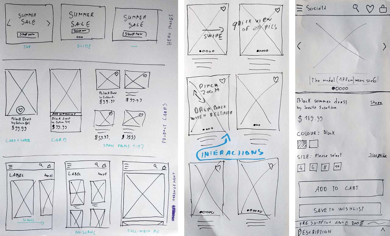
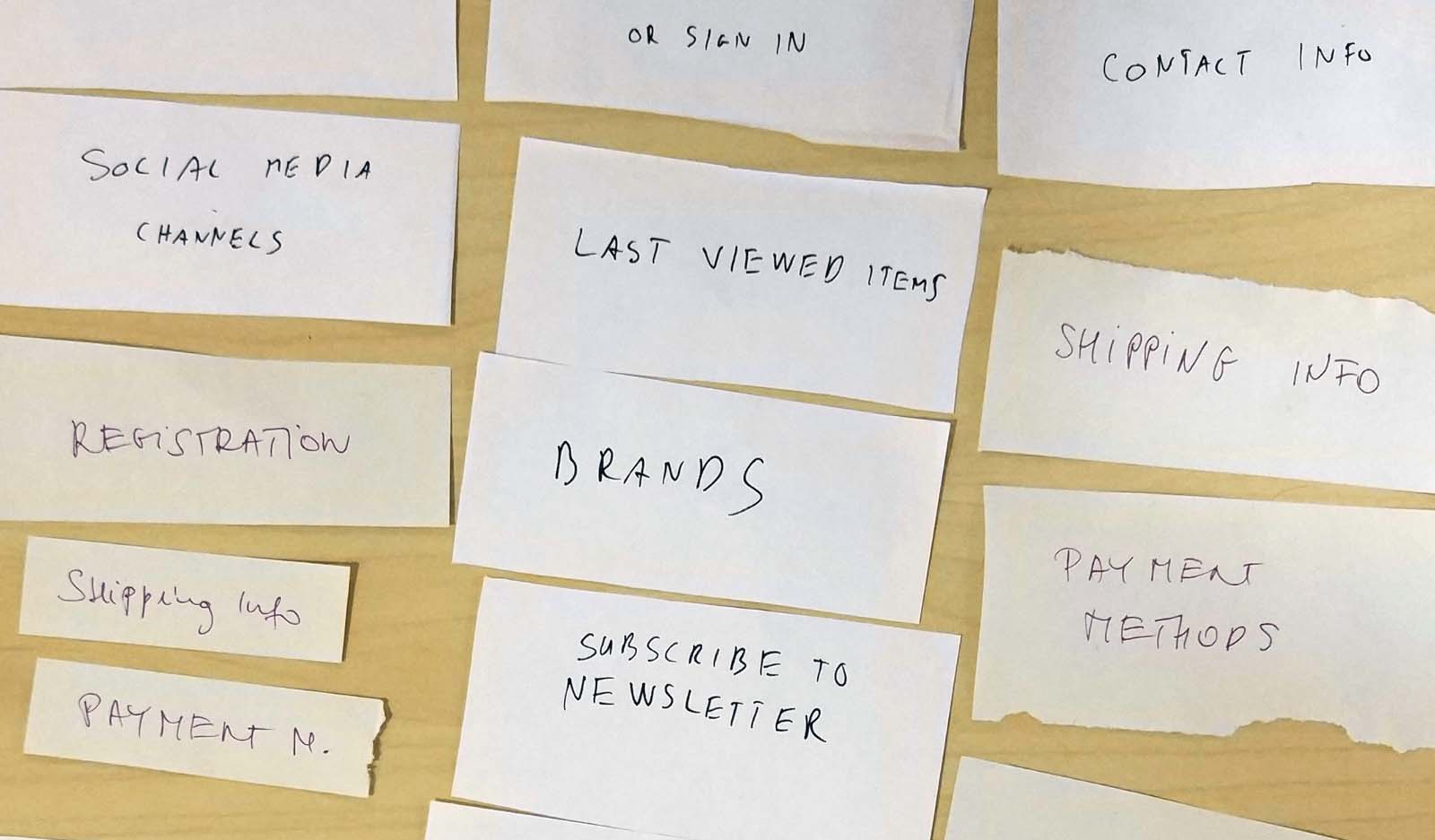
Paper sketches
When it comes to discussing different solutions with the team and quickly testing them with real users, paper sketches can be really useful. Here you can see some of what I created during the Société project.
Prototyping & user testing
After we validated the main concepts, I created interactive prototypes with Axure RP. We improved the prototypes in many iterations, which I found really exciting. The user tests resulted in a lot of information, including valuable insights on how to solve users’ problems. You can see some of the most interesting problems in the Challenges section below.
Here you can find the mobile prototype and the desktop prototype.
4. UI design
Once we managed to come up with working solutions for the identified problems, I started designing the final user interface.
(The empty state illustrations and some of the icons were created by a creative agency working closely with Société.)
I paid special attention to the brand characteristics (feminine, mature, high-end, minimalistic, helpful) and the personas’ needs (sophisticated, unique, and extra things).
Société mobile navigation concept
Challenges
1. The home page experiment
Problem
We had to pay special attention to the homepage because that is what users see first and it is the most important one among their touchpoints. We had to find out what they wanted to see there and considered the most important elements. Since we had a tight schedule, we had to find a research method that makes creating and testing the iterations really fast.
“The home page should tell me what the store deals with.”
Solution
Before starting to work on the homepage of the prototype, we carried out a quick card sorting test to discover users’ mental models of landing on an e-commerce site. I created some cards of possible homepage elements and Tímea asked people to group and organize them in an order that made the most sense for them. They were allowed to create new cards as well.
I also tried a new method, story-framing. TO learn more about this method, read Fabricio Teixeira's article on storyframing. It basically describes what a page would cover. 📖
How did I do it? Based on the user interviews and the card sorting sessions, I had a homepage concept in mind. I opened up a Google doc and designed the page with words, basically answering the question “How would you tell a friend what this page addresses?”. Then, I made quick iterations – I could easily modify the copy and change the order of the text blocks making the iterations very quick.
It was useful because I could explain to people what the homepage would address even before creating the prototype with little effort. It helped me focus on the page’s structure and core message without the visual clutter.
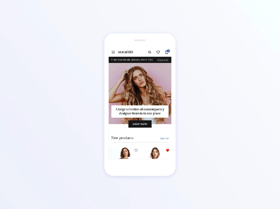
Below you can check how the the final version of the Société Store homepage turned out based on the story-frames.
2. The popup blindness paradigm
Problem
Bianca, the price sensitive persona, wanted to know if she could get any discount on items. She didn’t want to have to dig deep: she needed something obvious.
“I always check if there’s a discount first.”
Solution
I decided to highlight the discount available to our newsletter subscribers with a popup. During the tests Tímea found that people wanted to get rid of any popups blocking their way because they perceived them as advertisements. So, I made a little tweak and designed a slightly different modal window that doesn’t appear in the middle, but slides up from the bottom-right section of the screen (on desktop).
Newsletter subscription modal window in the desktop prototype
People would notice the element sliding up, but didn’t feel the urge to close it asap. Most importantly, it did the job without bothering them.
3. The convenience factor
Problem
The younger segment of our target audience found browsing item photos in online stores very time-consuming.
“Let’s say there’s a dress I like and I want to see more pictures. I have to open the description page of that dress to see all the pics, right? It just takes forever…”
Solution
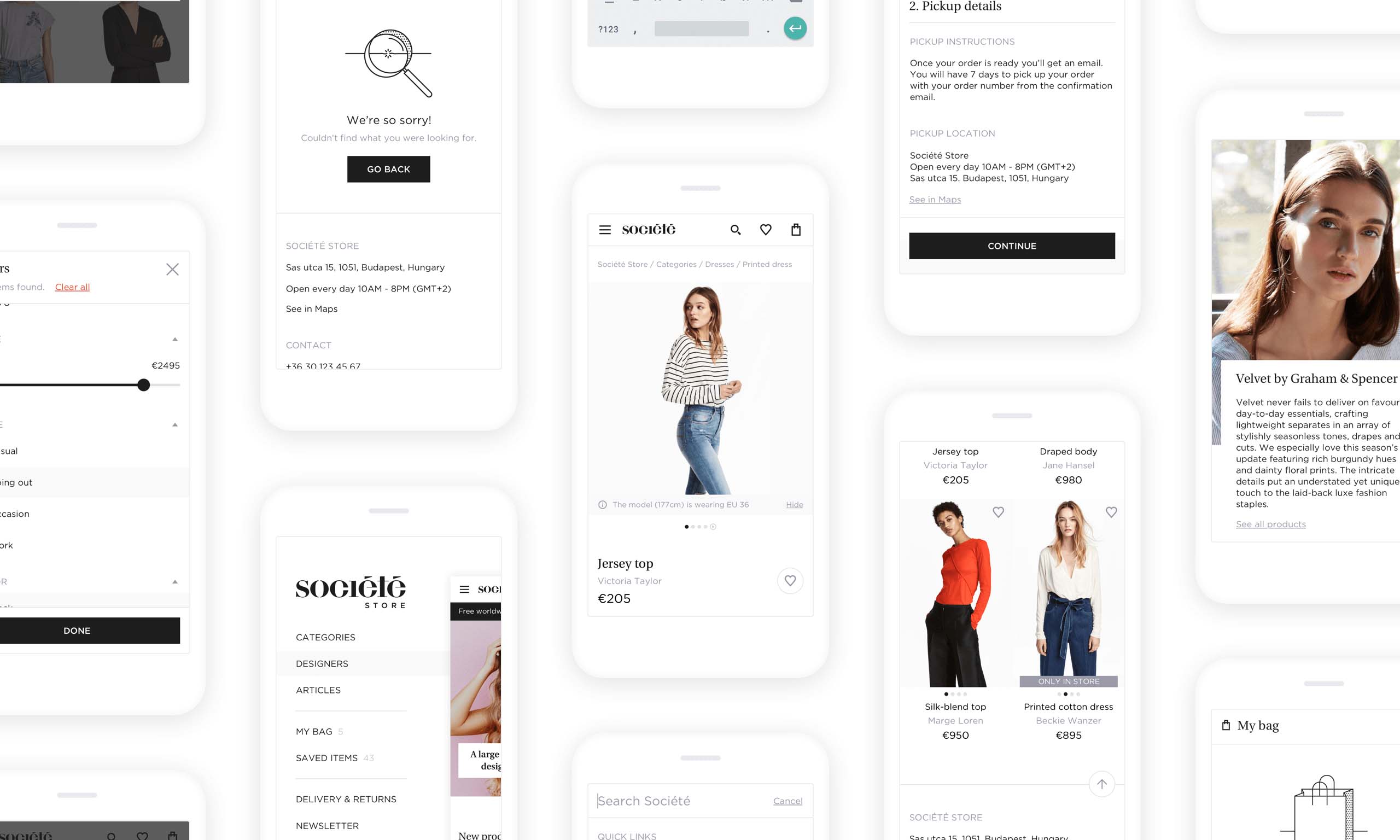
I wanted to show all the pictures of an item right from the list / category page. I implemented a quick-view solution in the prototype, a carousel that can be used to check all the photos of an item. Our users loved it.
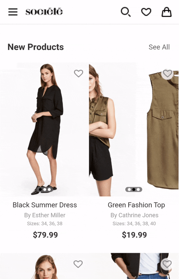
Quick view solution for checking item photos (mobile prototype)
4. The size chart conundrum
Problem
All the personas got anxious choosing sizes online. They all worried the item wouldn’t fit after all. They complained about usually seeing only standard sizes (like small or medium) on websites, which gives absolutely no information about the actual size.
“How should I know the right size when they don’t have a proper size chart?”
Solution
I wanted to create an accurate, easy-to-use size guide, so I designed one that compares different standards (including measurements in inches and centimeters).
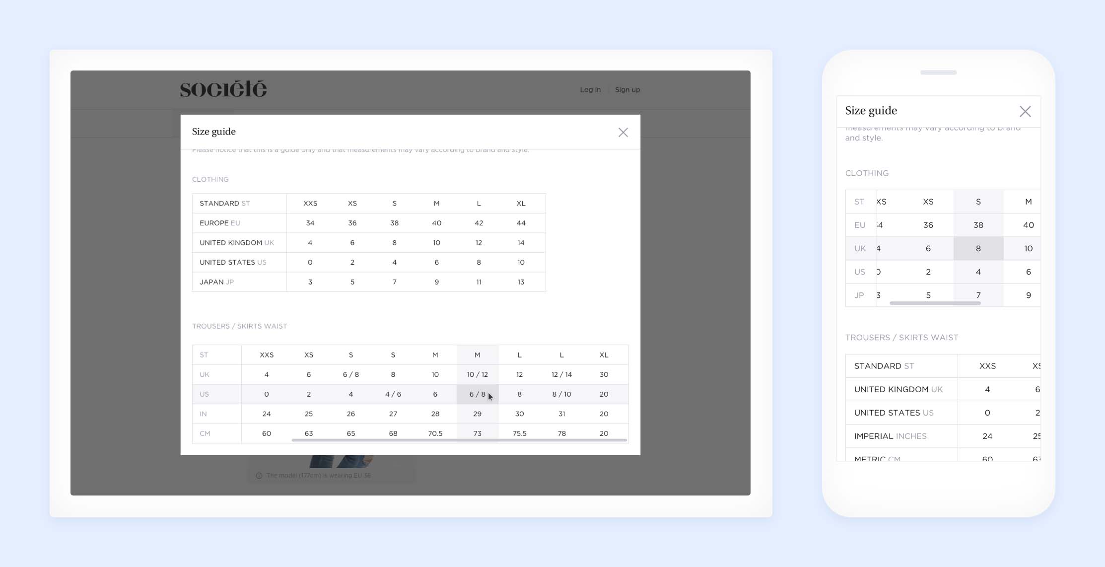
Size guide screens
I also designed the interface in a way that allows users to see each models’ height and the size they are wearing right below the item photo (it’s especially important if there are photos of more than one model).
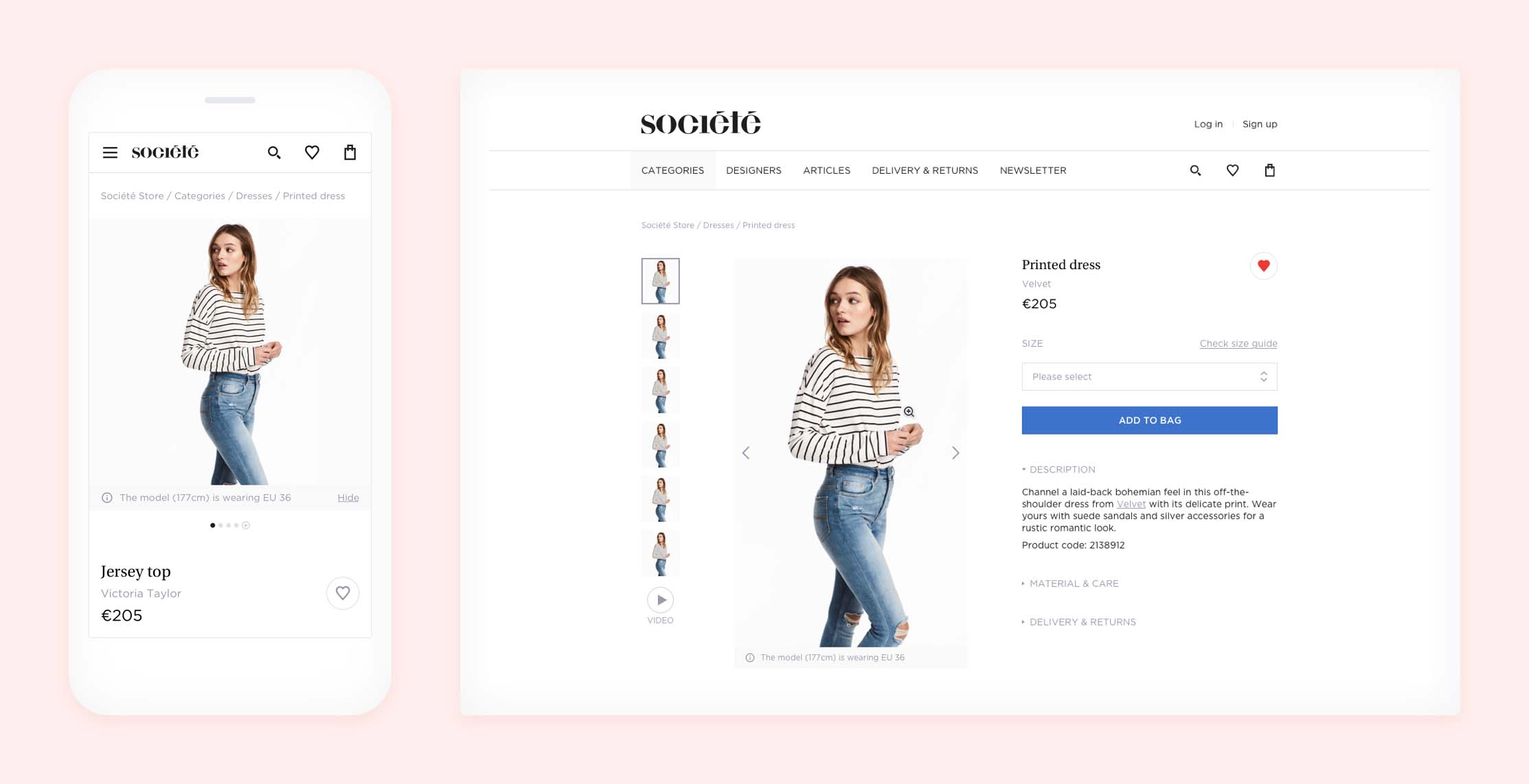
Product details with information on the model’s height and the item’s size
5. The recommendation stimulation
Problem
Eva, our third persona, sometimes doubted what items went well with others. She wanted personalized fashion advice.
“Sometimes I find it difficult to choose the right piece for myself.”
Solution
We found that we could help her with the following solutions.
In order to help her become more confident about her choices, we added a “pair with these” section below the item description, so she can see other items that go well with the product.
We also recommended Société to take at least one photo of each item where the model was wearing it with other items and accessories.
We tried to make the information about the physical store (contact information, location on map, opening hours, etc.) more accessible, encouraging people to visit it if they needed further assistance.
6. The checkout displacement
Problem
We noticed that all of our personas became stressed at the online checkout process, being afraid of technical problems or security issues.
“No way it’s gonna be smooth. Paying for stuff online always gives me a hard time.”
Solution
I created a straightforward checkout process with steps that people found easy to understand, including:
delivery options,
shipping address/pickup details,
payment options,
summary.
The solution combines the benefits of the single and multi-page checkout methods: all information fits on one page (customers can see all the steps), but only the active section opens, so they can focus on one step at a time (eliminating interfering factors).
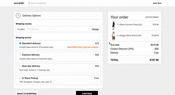
Checkout process in the desktop prototype
Users found this solution helpful because they could see their position in the process and could also easily go back to a previous step.
We found that people perceive the checkout process trustworthy if:
the interface actually tells them it is secure, by placing a “secure checkout” label somewhere,
they can use the interface easily and have an overview of all the steps,
the site mentions partner companies (banks, shipping companies, etc.) they trust.
7. Email automation
Problem
The client requested that we create automatic email templates (successful order, item shipped, forgot password, etc.) because they didn't have the resources to write them.
Solution
Although we're not professional copywriters, we decided to face the challenge and write the emails. Since Tímea was on holiday I worked with Bence Mózer, another researcher from UXstudio.
It wasn't an easy task, but I loved it because I had the chance to learn more about copywriting and improve my skills.
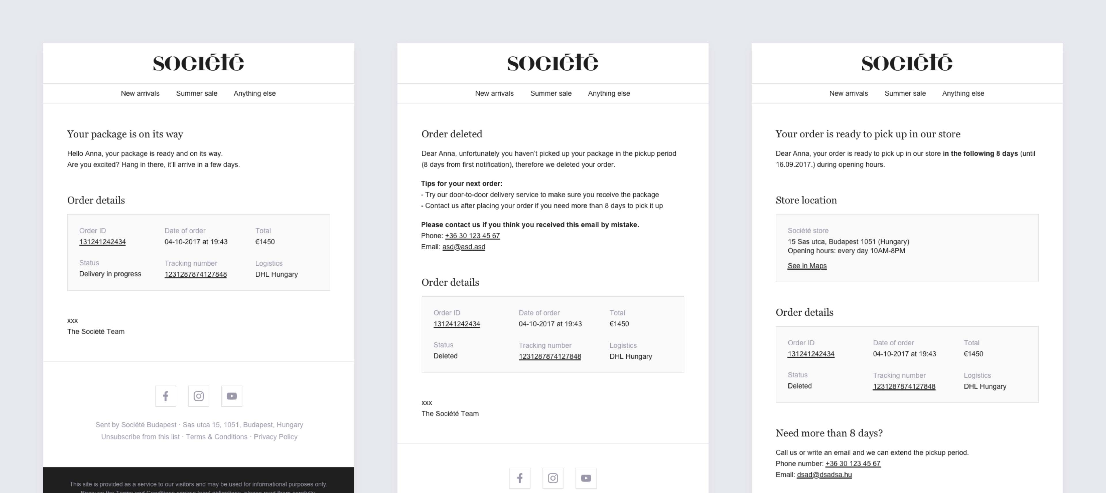
Some of the emails we wrote
Takeaways
I really enjoyed the chance to work on Société Store with some truly amazing people. I also learned a lot about the fashion industry.
My main takeaways include:
Research is key – We couldn’t have designed a lovable product without the help of the people who will actually use it.
Dare to experiment – Doing so in a real project might sound scary, but fortune favors the brave! Story-framing proved itself a very exciting and useful research method.
Small things can make a huge difference – Changing the newsletter subscription popup’s position or adding a “secure checkout” label don’t seem like big innovations, but they made user frustrations disappear.
Don’t judge a book by its cover – Writing all the email templates sounded frightening in the beginning, but it became a very exciting and important part of designing a complex service. Controlling a bigger part of a service means we can make it more consistent, which may result in a better user experience.
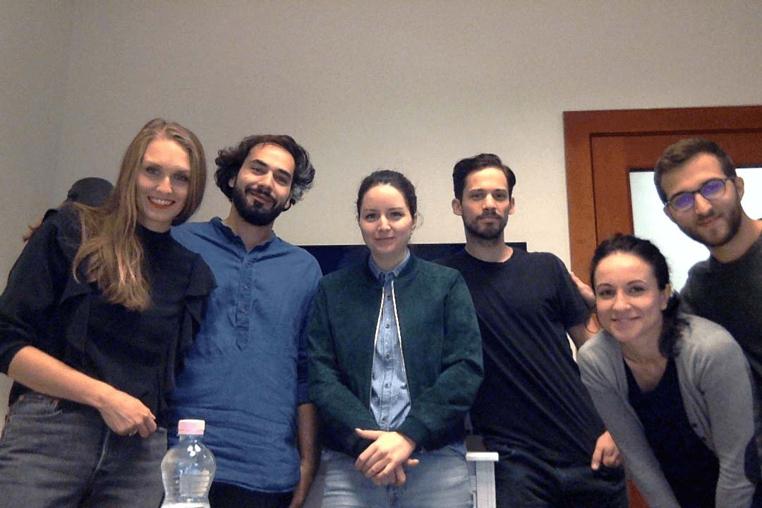
Close-out meeting with the Société team
Thank you for reading!