Sport360.fit
Sport360.fit is a lifestlye magazine mainly for women in Dubai. Its parent company already has a successful sports magazine, read mostly by men. They realised, however, that a lot of women read their health and fitness related content, so they decided to create a separate product targeting them.
Project overview
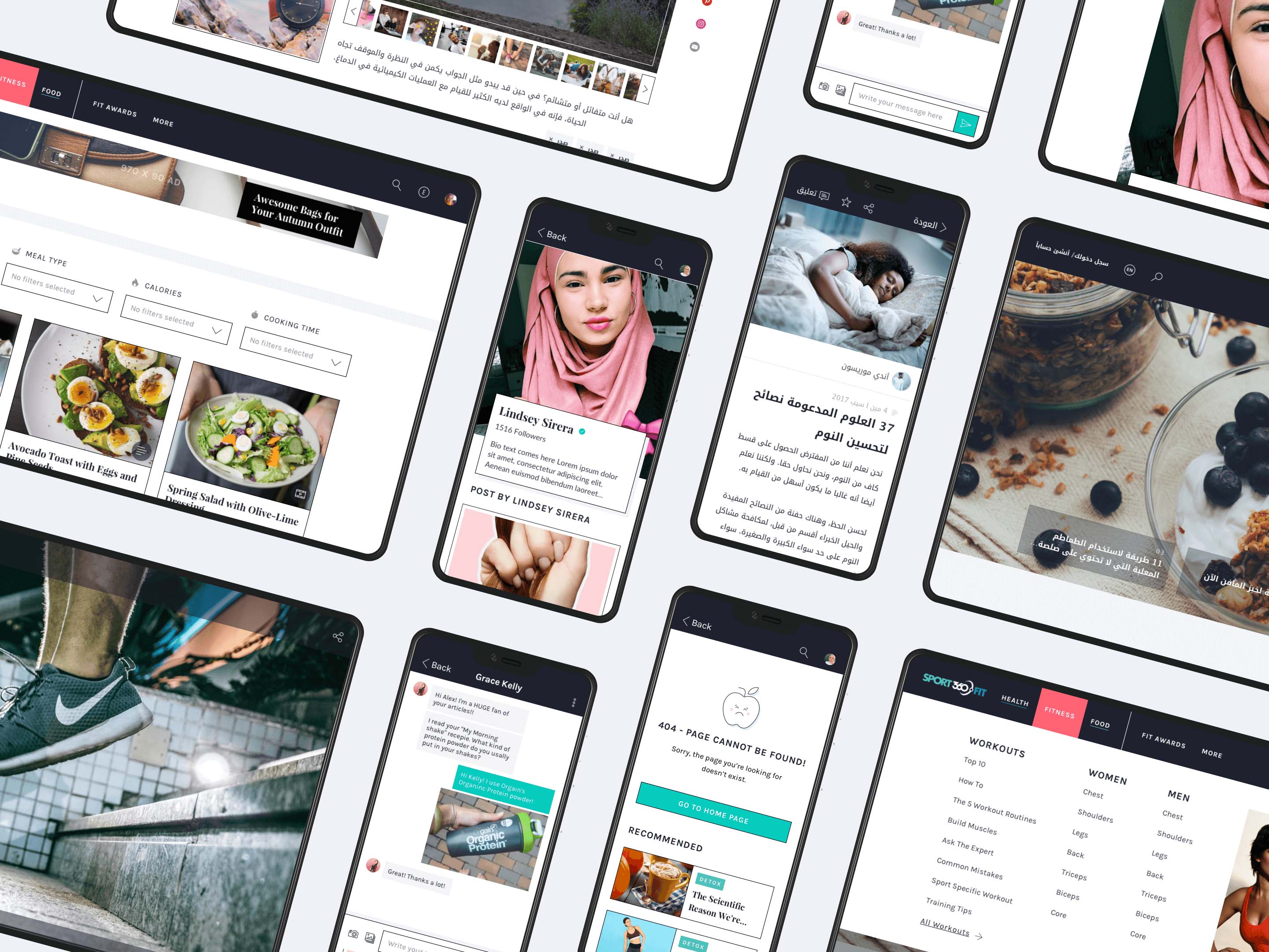
In October 2017 UXstudio partnered with Sport360.fit for a 3 months long project during which we designed a responsive website and its companion mobile application in two languages: English and Arabic.
My role
With a colleague of mine, I was responsible for designing the website but I was also involved in creating the mobile application. This was a vast project with a tight schedule, so I worked closely with 3 other designers and 4 researchers. Working in a big team like this is quite rare at UXstudio, maybe that's why I enjoyed it so much: we had several inhouse workshops together where we could solve complex design problems in no time.
Design process
Before diving into the challenges let’s start with a quick run down of our UX design process. During the 2-day long kick-off meeting we mapped out the project scope, potential fears, gathered some knowledge about the market and the desired target audience.
Then we built up the information architecture and continued with several brainstorming workshops. After making the web and mobile prototypes we designed the detailed UI – continuously testing them with users in both phases week by week.
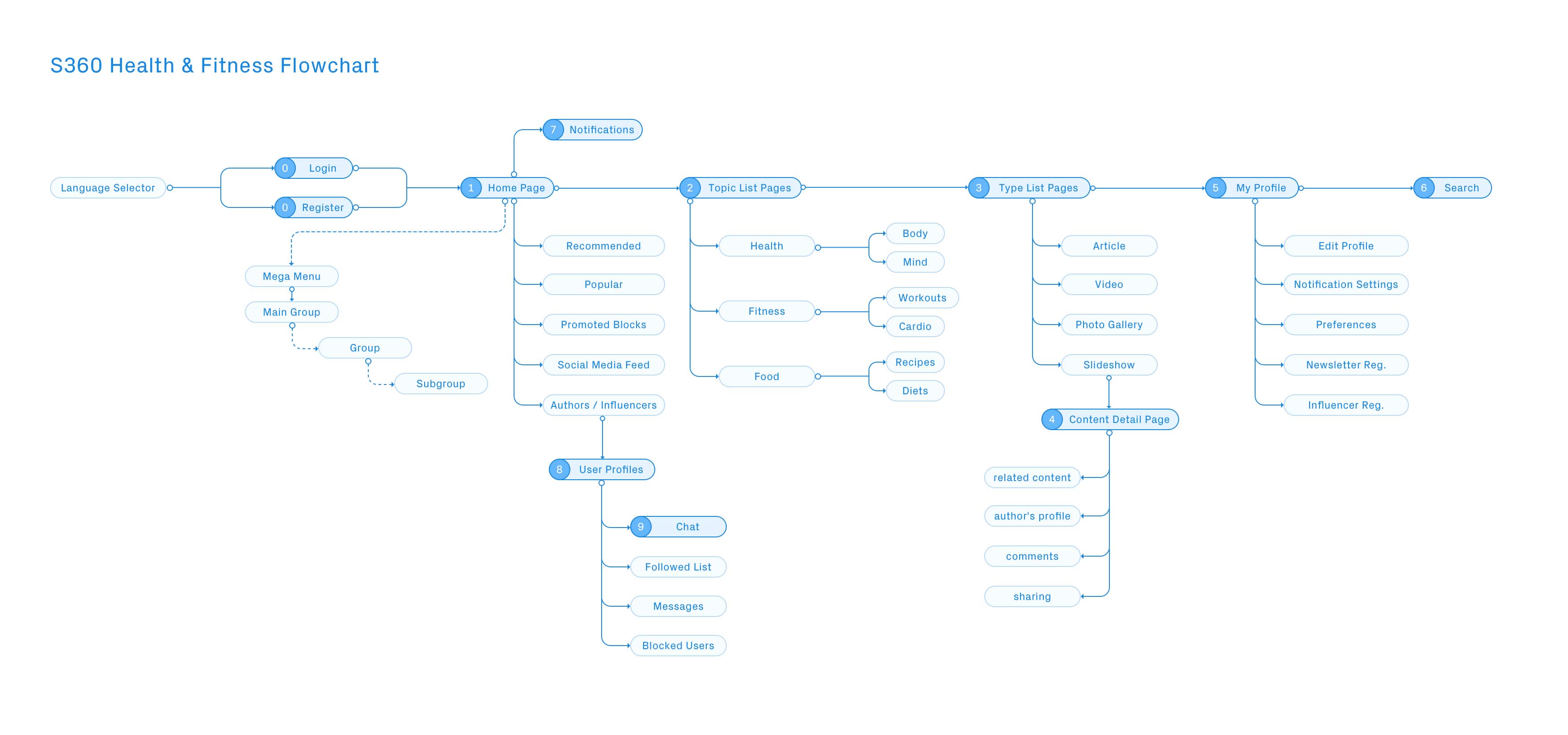
Visualisation of the information architecture
Challenges
1. Cultural differences
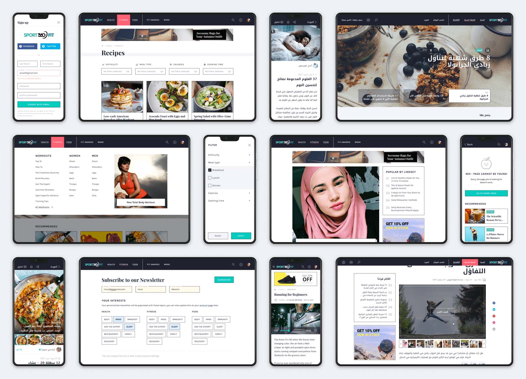
One of the most exciting challenges was to deal with the cultural differences. Since the main focus was on the Arabic market, when it came to the detailed UI, we had to design all the screens both in English and Arabic.
Arabic user interface
Designing the Arabic version wasn’t just changing the copy. We also had to pay attention to cultural peculiarities such as mirroring the interface (the Arabic language is written from right to left).
Some of us (including me) had already worked on Arabic projects before, so we had some experience on what UI elements to mirror and what to leave in their original form.
When facing difficulties the following resources helped us a lot:
Arabic apps / websites as referene
Feedback from usability tests
And if we were still completely lost, we were lucky to have the opportunity to ask the client.
Language selector
Since it was a bilingual website, our assumption was that users would find the language selector quicker if we used flags. It was a bad idea. During the user tests it turned out that people could find this offensive: the Arabic language is used in many countries and cannot be identified with one particular flag.
So, in the next iteration we dropped the flags, and since there were only 2 languages, we got rid of the dropdown too. In the new version users could switch languages by clicking on the shortened written name of the target language. It turned out to be a great solution because during the next usability testing sessions our users understood it very well.
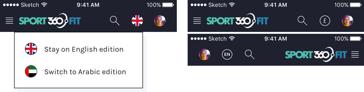
Language selector with flags (left) and the reviewed version (right)
If you're interested in reading more about my history with and learnings about language selectors, check out this post on Medium:
Character spacing
In the English UI we used some extra character spacing on some of the elements to make them more readable and easier to be differentiated from other elements.

Naturally when we translated the UI to Arabic, we kept the character spacing but we learned that doing so the font gets distorted and causes readability issues.
In the Arabic language each letter has more shapes, depending on context. If we want to be scientific about it:
“When adjusting intra-word spaces (i.e. the space inside the words) only these spaces can be adjusted.” – W3C Text Layout Requirements for the Arabic Script
Luckily, Sketch app has a unique issue with handling extra character spacing in a right-to-left font: it simply fails to show some of the letters, so we always knew if we forgot to remove the character spacing.
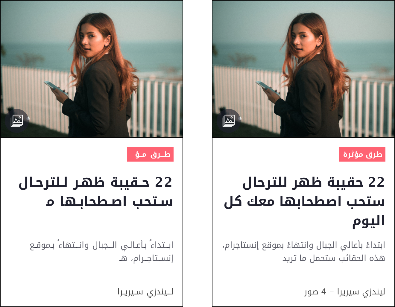
Category label on an article card with (left) and without character spacing (right)
2. Remote Communication
Client communication
Remote communication is never easy but we have a method that works most of the time. We travel to the client for kick-off, then get back to our office and continue the communication remotely during the weekly meetings – usually on Mondays. This time, though, it was a bit different.
Since this was a short project (considering the amount of work) with strict deadlines, continuous communication was a must and one weekly meeting was simply not enough. In order not to have 4-hour long conversations every Monday, we sent out daily summaries via email, and had a short 15-minute Skype call every day to speed up decision-making and reviews.
On top of that, the client gave us detailed feedback in a structured, colour-coded Google spreadsheet, so our primary communication about design and features all happened in written form.
At first, this solution seemed overwhelming, but we had to admit: it was quick, sped up the weekly meetings and eliminated confusion about who said what on which Skype call.
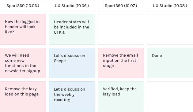
Example feedback sheet
Communication with the developers
Since the client’s developers worked in Spain, we had to make sure we create proper specifications to speed up remote work. Beside several Skype calls and emails, we left many comments in the Zeplin project and also created an extensive kit with all the basic UI elements’ different states (hover, active, inactive, etc.) and styles.
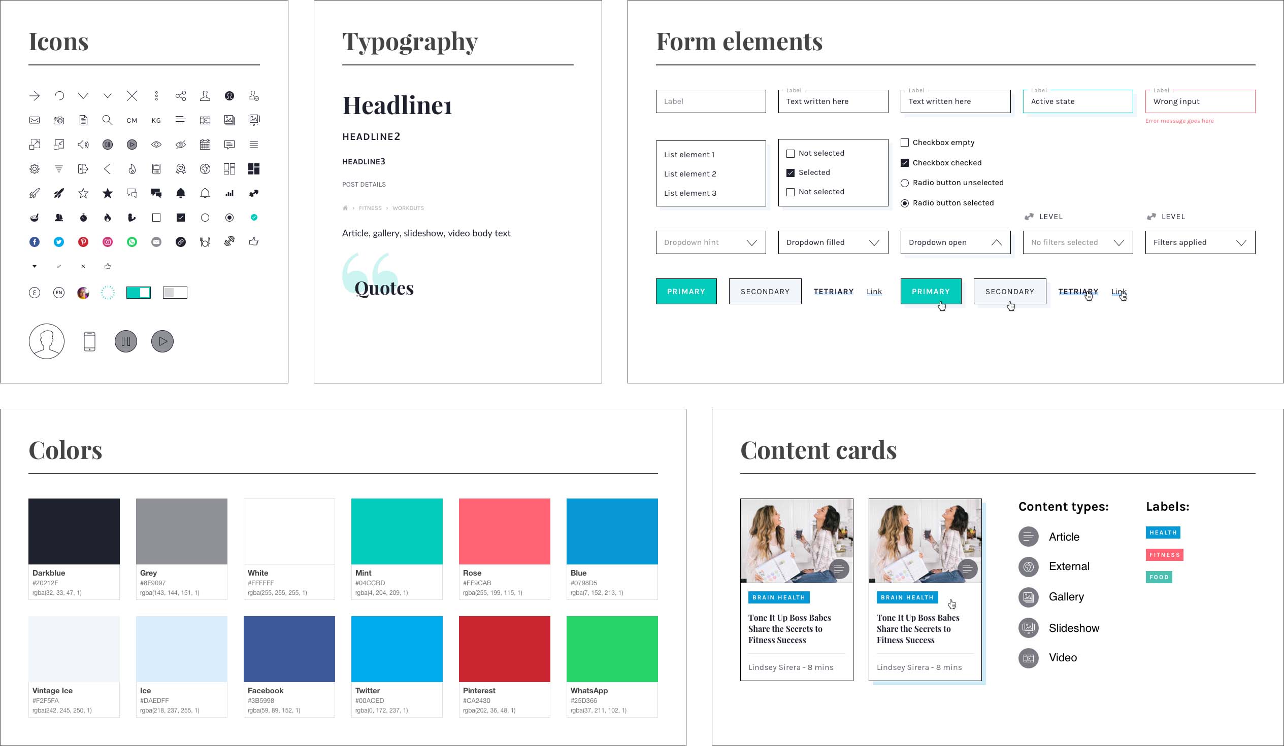
A small part of the UI kit
We also felt the need for creating animations on how some of the micro interactions should work. Doing so came very handy when it came to describing our ideas.
Here you can se an animation I created for the developers with Principle.
Animation to explain nav behaviour, profile dropdown and text input interactions
3. Big design team
Scheduling
In the beginning of the project, we made a schedule ensuring that no designer will work on the same screen at the same time. So, for example, one week, designer A worked on the article pages, then the next week designer B worked on the article pages on a different platform.
Since the assets were easily scalable and reusable, designing a finished page on a different platform was much faster than having to design each screen at the same time for different platforms.
Internal communication
Whenever we had questions, concerns, little problems, of course, Slack was the channel we communicated on, and we even sat next to each other in the office, creating a little island, in case something came up.
This also helped us in the earlier phases in the project, where we had to set up the information architecture and plan the first iteration of screens.
We usually do sketching workshops where we invite other designers from the office to ideate about a problem we face on a project. In this case we didn’t need this, because we were already a team of four. Every ideation session was like a workshop, so we came up with a lot of ideas in a small amount of time.
Design tools
We used Axure’s team project feature for prototyping. Since we set up a sturdy project schedule in the beginning, the whole process was smooth sailing apart from some minor glitches. Two designers worked on the desktop version and two on the mobile app.
The big design team was definitely a plus in the earlier phases but then we reached the detailed UI phase. 😱
We had a meeting about what to use: Sketch or Figma. We collected pros and cons for each software and tried to evaluate which one would work better. The main points were:
Figma: great for collaboration, although new for us, and we were afraid of slowing down our process a bit too much. Plus Figma didn’t have Zeplin import back then, and we weren’t sure how the client would react to yet another software change (we worked on a different project before with them where we persuaded them to use Sketch+Zeplin instead of Photoshop).
Sketch: libraries just came out at that time, so we wanted to try it, and we were already comfortable with it enough that we knew it won’t slow down our process.
So in the end, we opted for the solution which would assure a smoother and quicker process instead of a better tool for collaboration – looking back, we might have chosen the wrong one.
Design system
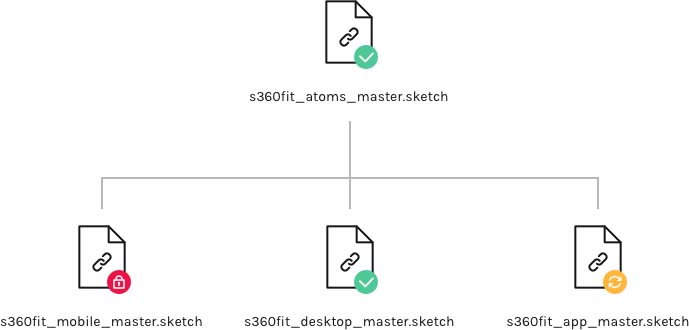
We set up Sketch with two layers of libraries. One basic library for atoms/molecules such as icons, buttons and any elements which could be used for all the platforms. And then we had three platform-specific libraries using our first library as a base for web responsive, web mobile and for the mobile app.
These four libraries were stored in the cloud using Box – because this was the only solution which let us lock files, so we wouldn’t end up messing with the library while someone else is editing it. It was a working solution but probably by far not the best one – especially compared to Figma's multiplayer editing.
4. Content types
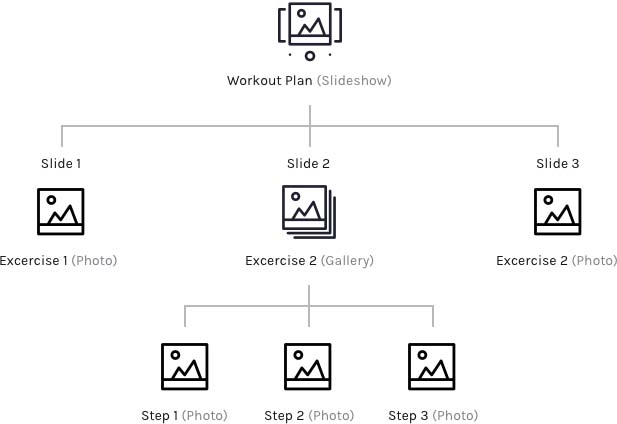
The platform has many content types: articles, videos, slideshows and photo-galleries. These content types can also be mixed. While putting a video in an article or having an in-text photogallery was a piece of cake, we had more complicated content types as well.
One that caused us the most headaches was the slideshow which contains a whole photo-gallery on one slide, e.g. more complicated exercises had to be explained with a series of photos.
Here’s an example of the structure of workout plan slideshows:
We started with the simplest solution and worked our way to the end result:
Version 1
The gallery on the slideshow page looks exactly like the regular gallery, except here, switching slides is indicated by little squares. This solution didn’t work because users were not sure what the indicators are for: navigate the gallery or the slideshow.
Version 2
To see the photos in the gallery users have to open it in a popup. Navigation buttons are placed at the end of the article text. But this version didn’t work either, because users did not find the buttons if the text under the slideshow was longer than the screen.
Version 3
Slideshow navigation buttons are sticky at the bottom of the screen. Users could finally navigate properly on the page but the client insisted that it takes up too much of the screen so we had to drop the sticky buttons, so we had to come up with a compromise.
The compromise
We combined the first and the second solution: we placed small photos to show this is a gallery and also moved the buttons up right above the slide’s title. Luckily it turned out to be a good enough compromise, because users could still navigate through the pages
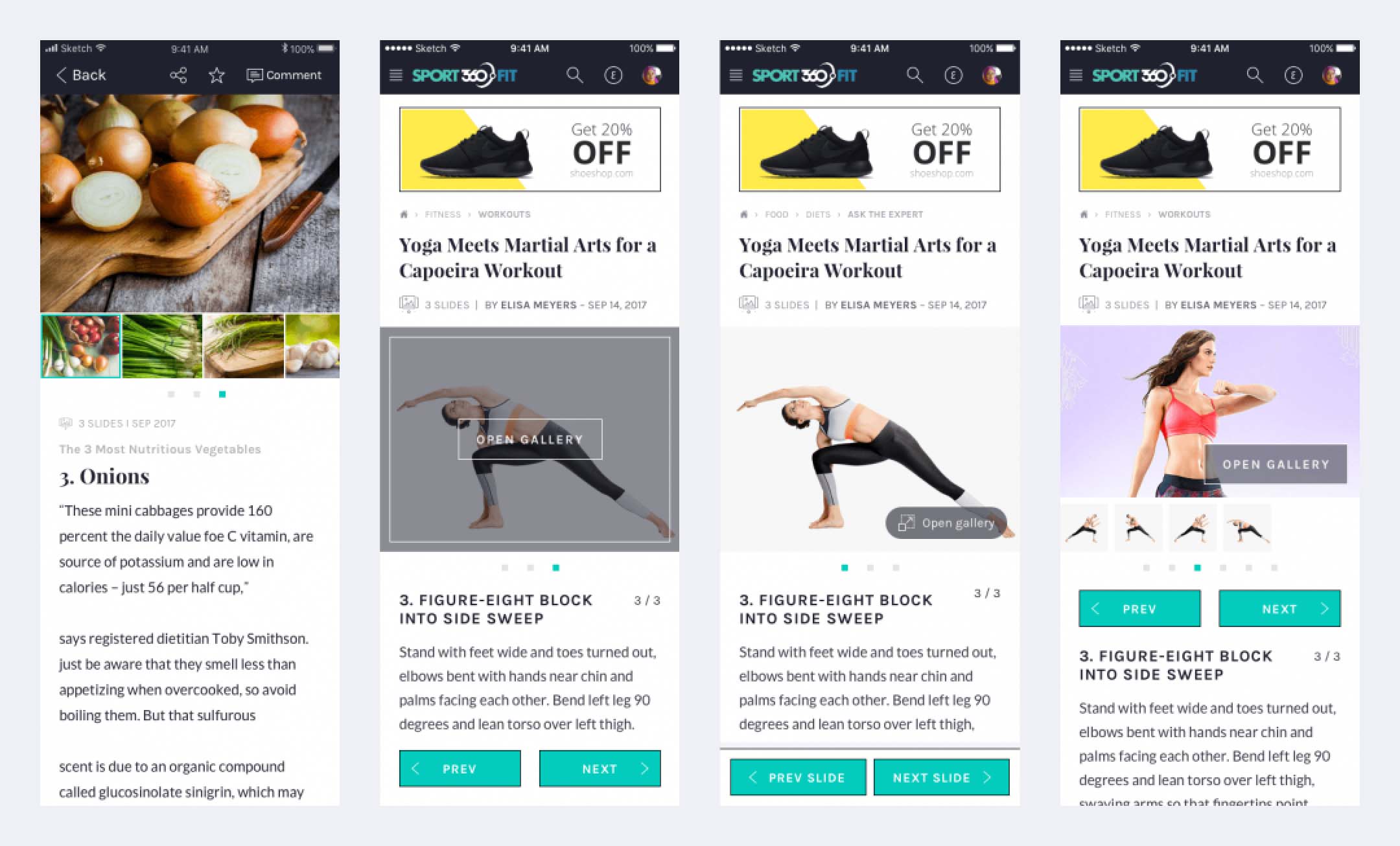
The four slideshow + gallery versions we made
5. Visuals
Look and feel
Since the site’s main target audience were women, the client wanted to go for a light, friendly (even a little cute), fresh yet traditional look and feel. We created four different versions of the home page to show our ideas, then had a workshop with the client to get feedback.
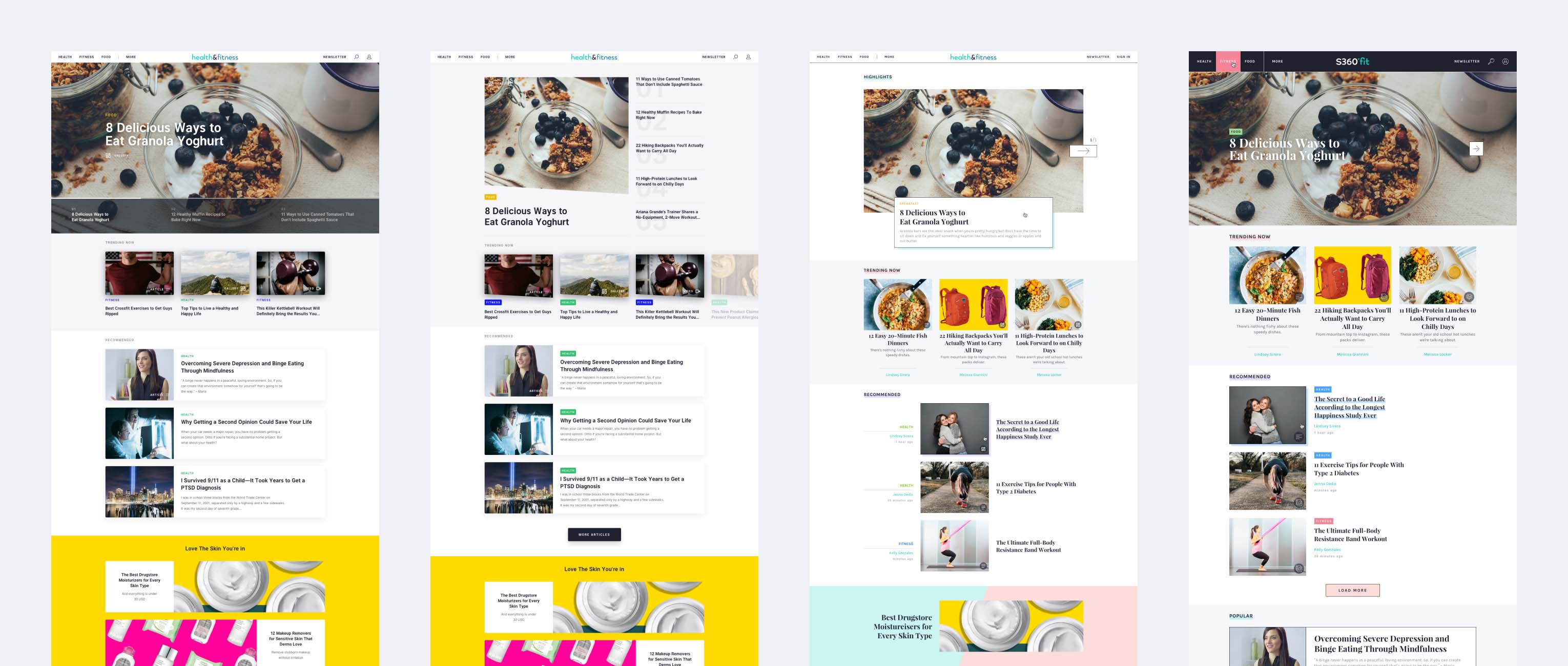
Early look and feel versions
After they had told us which UI elements they liked from each version we combined them to create the final version.
Some of the final screens
Illustrations
We pinpointed some steps in the user journeys where people experienced outbursts of emotions – such as excitement or frustration e.g. at the end of the influencer application process or when seeing error states.
We wanted the applications to reflect on these emotional states. In harmony with our look and feel we created some cute illustrations to make people smile or to lower their stress level.
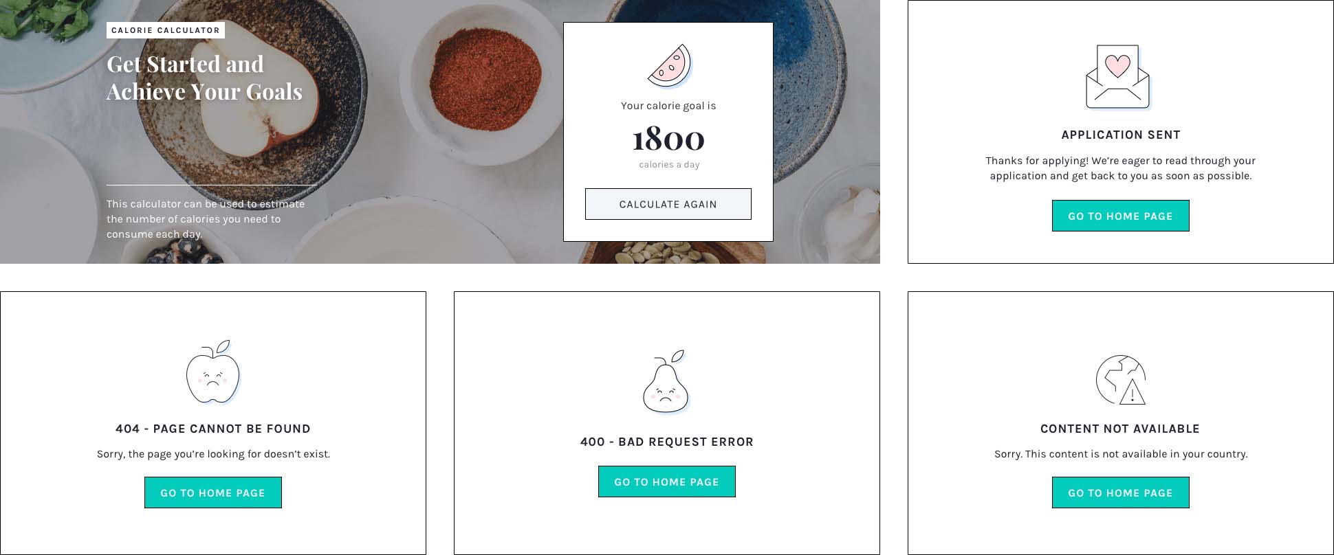
Some of the illustrations we created
Takeaways
I enjoyed working on this project very much and also learned a lot. My main takeaways are the following:
Always test with the right target audience: In most UX projects this goes without saying but here it was even more important. Having limited knowledge about the culture and the market, our target audience gave us crucial insights which we haven’t been able to get otherwise.
Be precise when creating the schedule for a short-term project: Plan out every team members’ task day by day if you need to. This way you can avoid having two designers working on the same screens simultaneously. Plan in a way that designers can use each other’s assets and screens to speed up the collaboration.
Be flexible when it comes to collaboration: We all have our preferred working and communicating methods but if the client wants to introduce something else don’t say no right away. Start using it, test it, see if it’s working: you never know, you might end up with a method you’ll love later on.
Don’t be afraid to try out new tools: It’s intimidating to start using new tools during a live project but sometimes you don’t have the time to try it before. If you have an inkling that another tool might work better, do it, because you will be stuck in an infinite loop of “what would have beens.”
Pay attention to details: Create a user journey, identify points where you can introduce little delights (e.g.: illustrations, feedback screens). Building up a personality for your product is not only fun, but it will engage your users in a whole different way.
Special thanks to Klaudia Simon, one of my colleagues and friends – who was the project manager on this one – for writing this case study with me.
Thank you for reading!