Xeropan
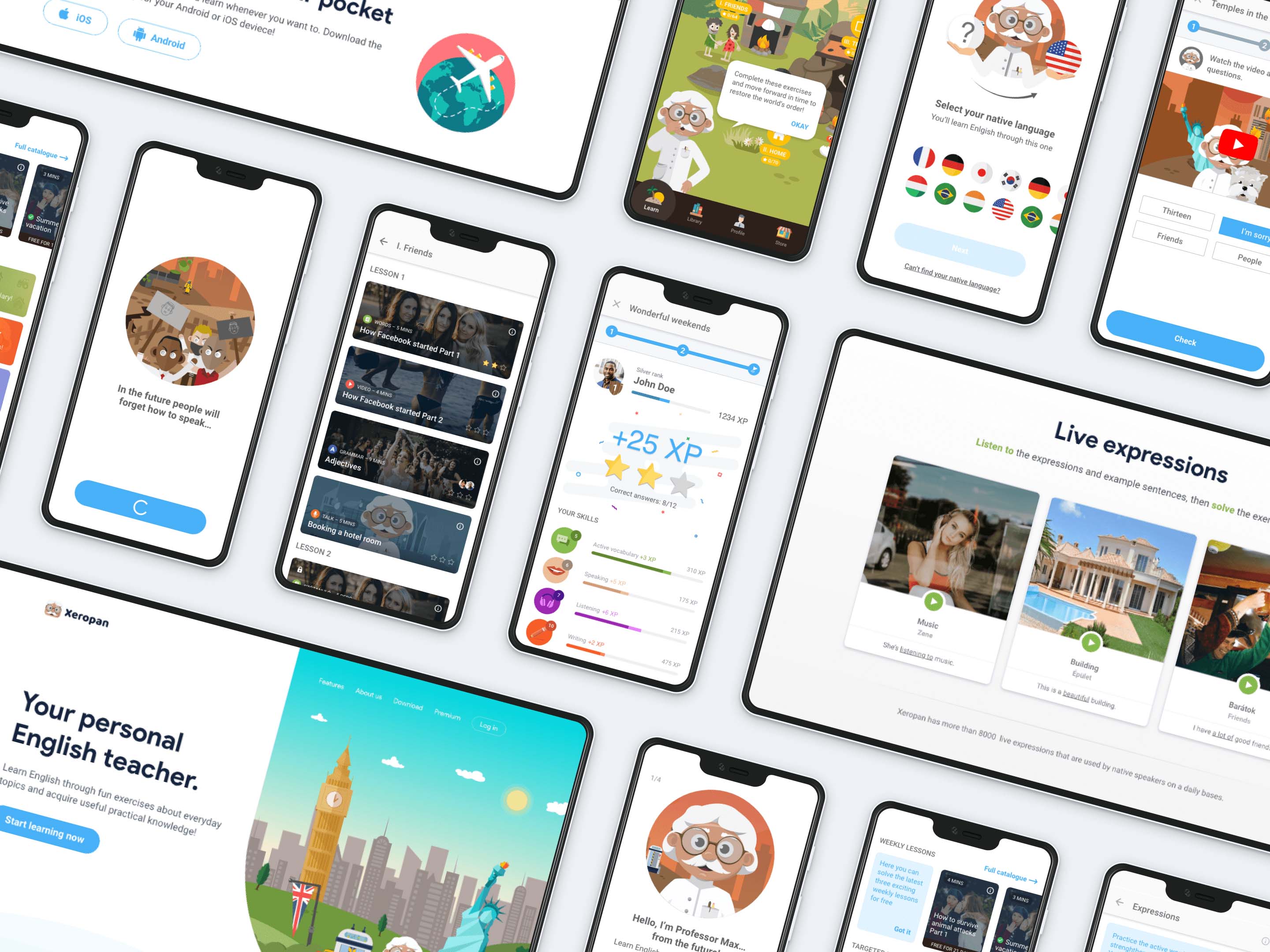
Xeropan is a gamified language learning application that helps thousands of people learn English with fun exercises such as interactive videos, chatbot conversations and weekly lessons. In 2018 they realised that a lot of users had stopped using their product after downloading it and going through the user onboarding process. So, the Xeropan team asked UXstudio's help to show users how valuable Xeropan really is. We aimed to reduce churn rate and increase user loyalty by making the product even easier to interact with.
About the project
Scope & team
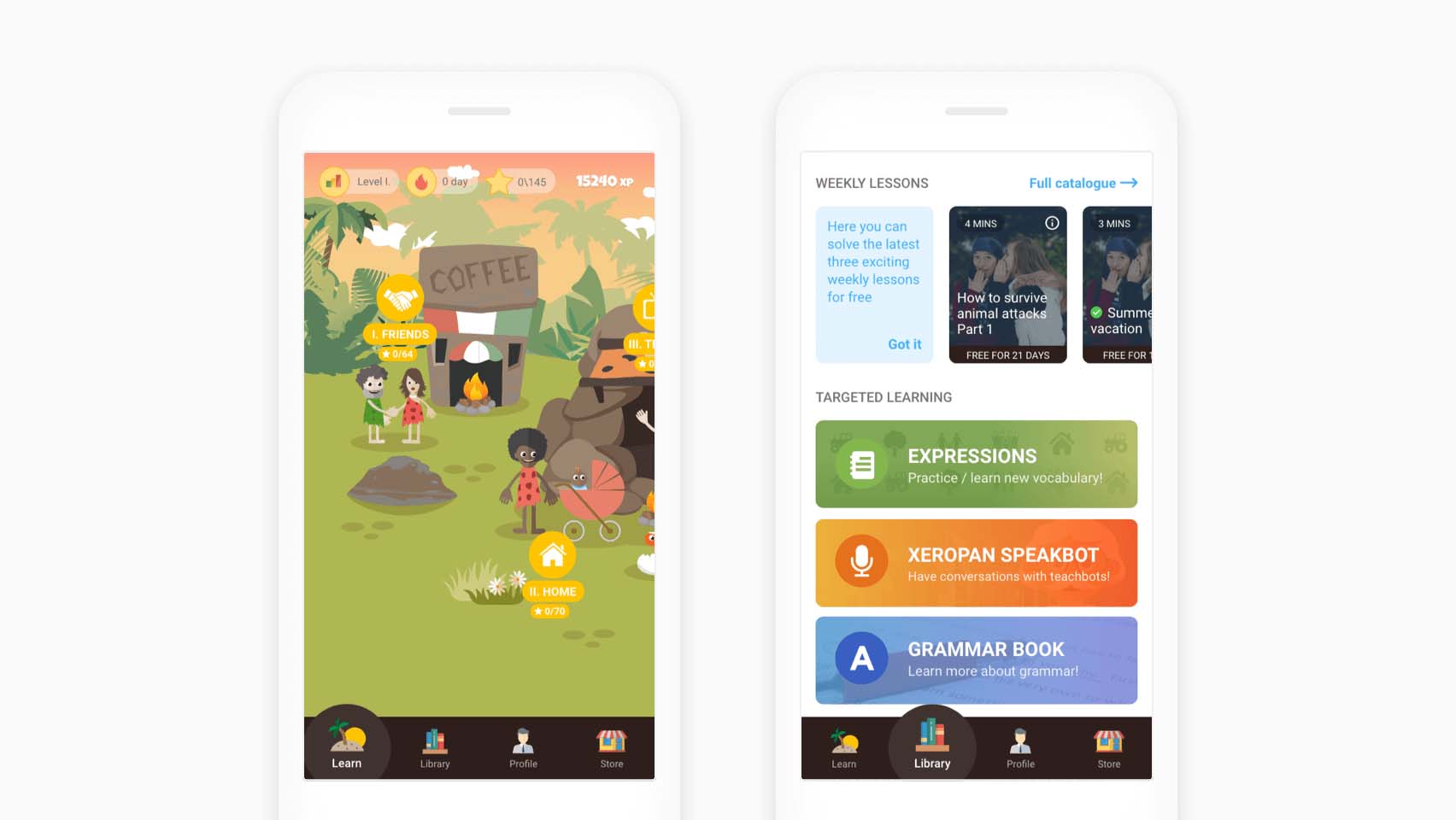
The work started in April 2018 and took seven weeks during which we redesigned the Xeropan Android application and their landing page.
I worked closely together with Bence (UX researcher and colleague), as well as Xeropan’s CEO, developers, marketers and other team members. Besides my regular design related tasks, as a project manager, I had to make sure everything went well (communication, deadlines, solving product related issues).
Defining the problem
I found the beginning of the process exciting because of the complex problem we faced. We didn't know what the reason was behind the increasing churn rate. We only suspected that something didn’t work quite right with the onboarding UX. To find out why people had stopped using the app, we did what we always do. We started digging.
Kickoff workshops
The kick-off process started with a bunch of workshops involving Xeropan’s CEO, developers, and marketing and language experts to find out more about the industry, the company and their customers.
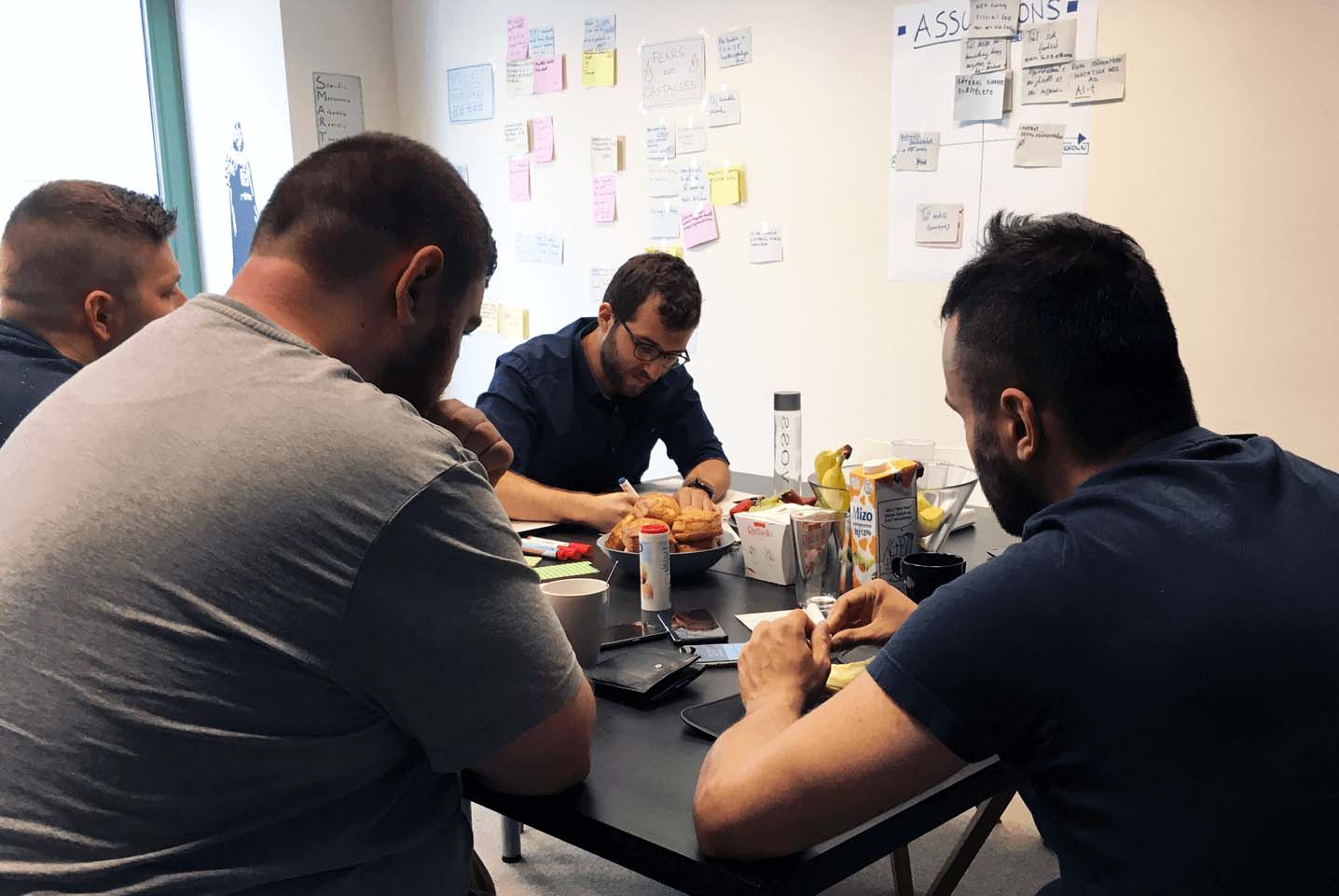
Kickoff workshop with the Xeropan team
We identified the goals of the collaboration, talked about fears and obstacles, features, competitors, technical requirements, created the brand’s persona, and mapped the current and ideal user journeys.
We also checked the analytics data. It showed how a lot of users stopped using the product after downloading and going through the user onboarding process.

I got this post-it note from one of my colleagues before the kickoff workshops 😊
Initial research
We wanted to find out more about the problem, so we had to dive deep into the details. Since they had an existing version of the product, we decided to run user tests (with mini interviews) to find out where the onboarding process went wrong.
I led half of the ten user tests with Bence as an observer. He gave me instant feedback after each session to improve my UX research skills.
We conducted a competitor analysis as well to find out more about the best practices to reduce churn rate.
Taking the existing application under a microscope, we also did a heuristic evaluation: we collected potential usability problems and ideas.
Findings
After evaluating our findings, we found we were facing a complex problem. Three main issues that caused the increase in churn rate:
Users found the onboarding flow somewhat annoying and didn’t understand the main story.
In-app navigation proved difficult, and people didn’t find everything they wanted.
People had some accessibility issues while using the app.
Solutions
1) Initial user onboarding
The problem
Xeropan’s onboarding flow wanted to tell the user about the backstory of the time traveller Professor Max. It should have shown how the world became a chaotic place where people forgot how to speak languages, and that only the user can set things right by learning English and moving forward in time.
However, while testing the old version, we found that most people just didn’t get it. They found the onboarding flow difficult to understand.
People also mentioned that they got excited when opening the app for the first time and wanted to discover it on their own. But they soon got frustrated because loads of onboarding chat bubbles popped up, blocking their way.
They felt overwhelmed and wanted to get rid of these things that kept appearing on their screens unrequested.
In this video you can see the old version of the user onboarding flow and the feature called “Word Builder”
Users didn’t want the app to tell them what to do next. Instead, they rushed through the whole flow without reading the story details and the feature-related instructions.
It also didn’t help that once you cleared away a chat bubble, you couldn’t bring it back. So, later when people wanted to use a feature, they didn’t have any instructions since they had already deleted them in the beginning.
And because in many cases, the UI proved too complicated, people ended up not understanding the features.
The solution
After discovering our users' motivation and the problems they had faced, I started sketching. I came up with ideas to achieve the ideal user journey.
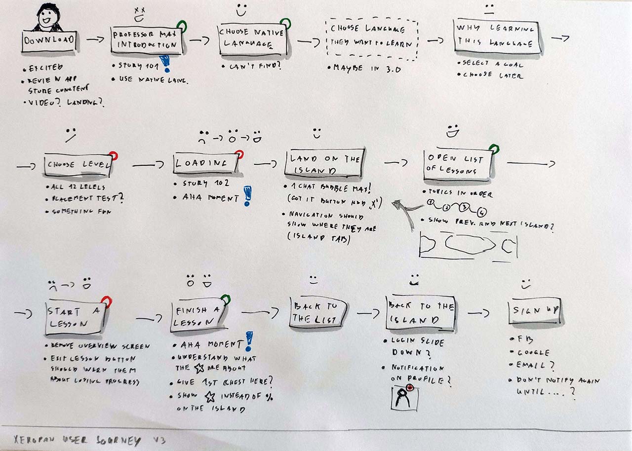
Sketches of the ideal user journey
I wrote new copy and removed almost all the chat bubbles. “Smart cards” with shorter, easier to understand instructions replaced them.
Onboarding with chat bubbles vs. smart cards
These elements also don’t pop up. They rest on the same level as other UI elements, letting the user decide when they want to read them and when to clear them.
After a brainstorming session with the Xeropan team, I put together a high-fidelity prototype. Then, we started testing it with people from the target audience. After a few iterations and another brainstorming session with the engineers, we had the final version of the onboarding flow.
In this video you can see this new version of the onboarding flow and the feature called “Expressions” (previously “Word builder”).
We found that people enjoyed the new onboarding flow and finally understood the basic story as well. The ability to discover the app at their own pace eased their frustration.
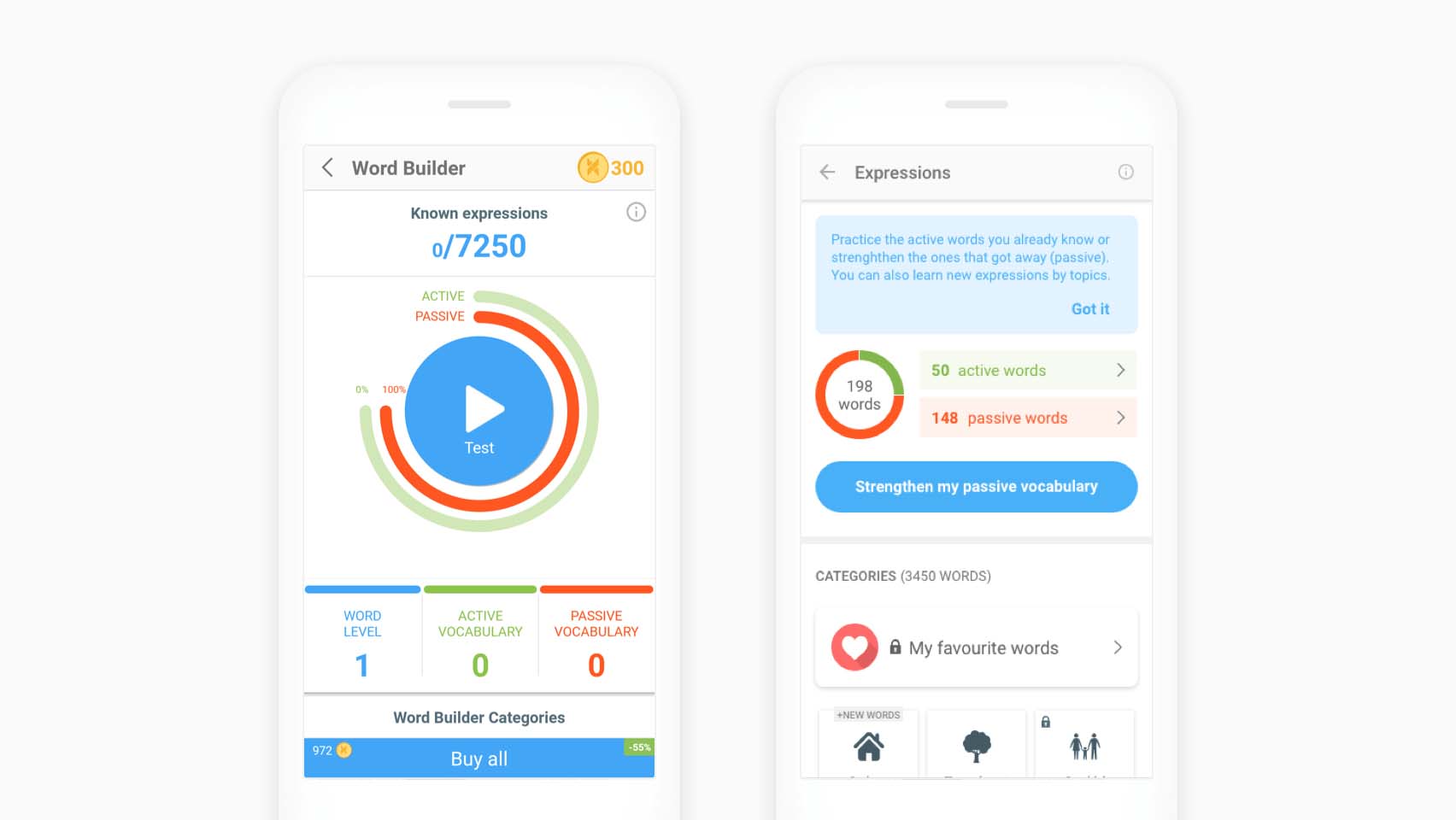
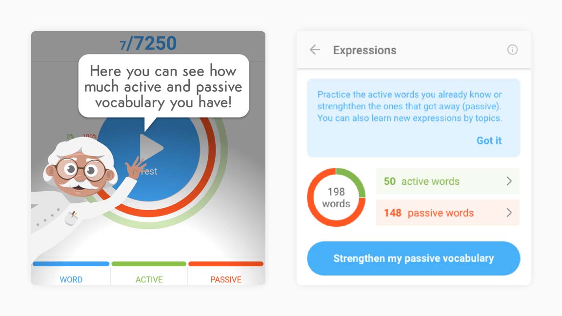
Word builder (old) and Expressions (new) features
We also redesigned Xeropan’s landing page because we found that the onboarding experience starts right there for many people.
Xeropan's new landing page (desktop version)
2) Navigation and structure
The problem
Our users couldn’t find what they wanted easily or differentiate the core lessons from the practice exercises. It affected the onboarding experience and customer retention, so the churn rate as well.
They also didn’t understand the big pencil icon’s function. They believed it would create a new list of lessons, practice their passive vocabulary or edit something.
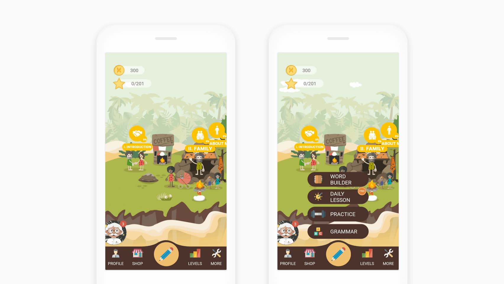
The island with the core lessons and the extras (old version)
In many cases, people didn’t know their location. They found it difficult to go back to this main view with the island when they wanted to see the navigation bar again.
The problem was that it didn’t work like in other Android apps. Once you tapped on an item, the bottom bar disappeared and you went one level deeper. See the profile page below for an example:
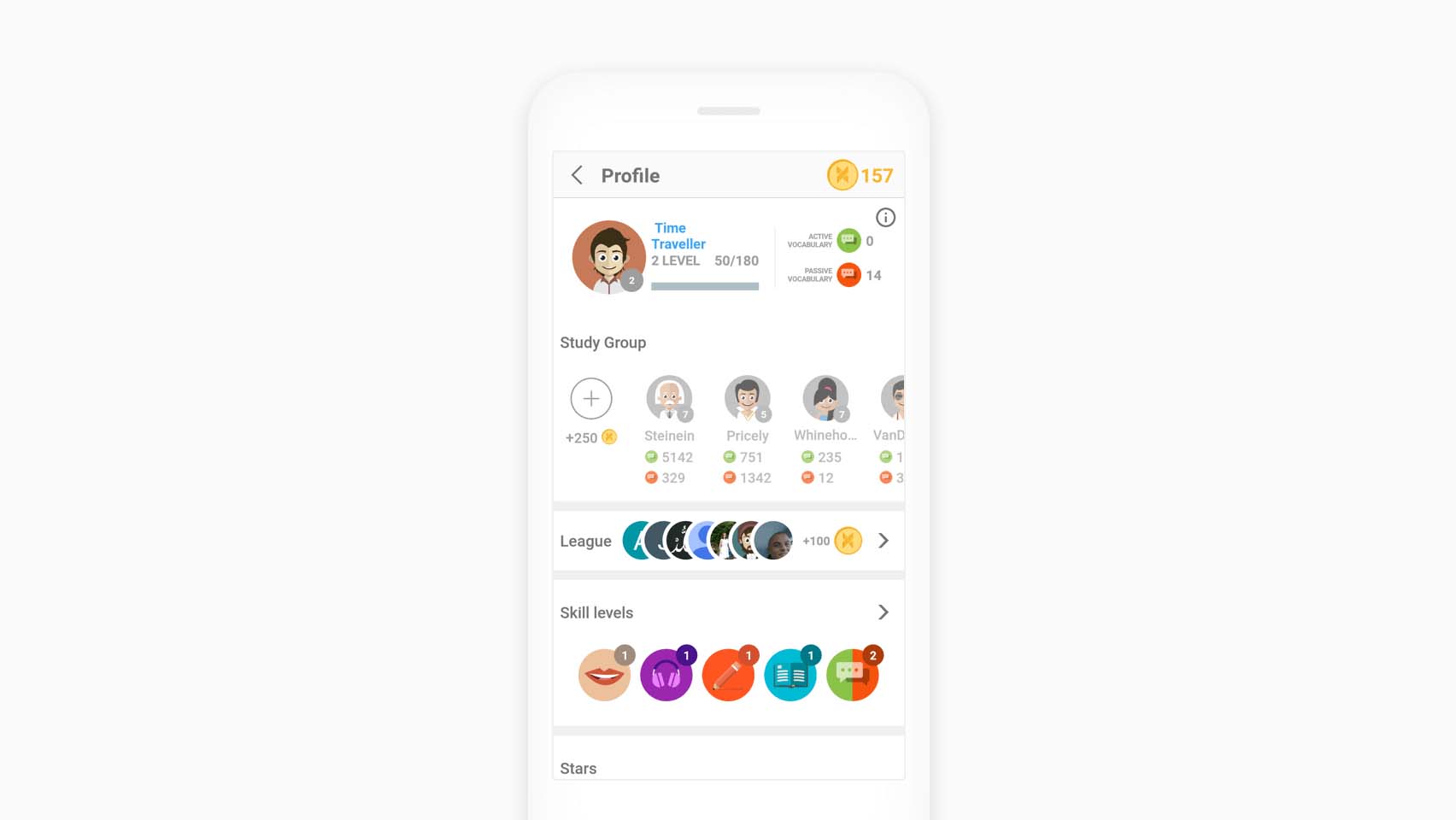
On the profile page you can't reach the bottom navigation bar (old version)
The solution
Evaluating the test results showed us the pain points our customers faced. So, I started working on the new navigation and structure.
I made paper sketches to iterate through many of my ideas and discussed the pros and cons with the team.
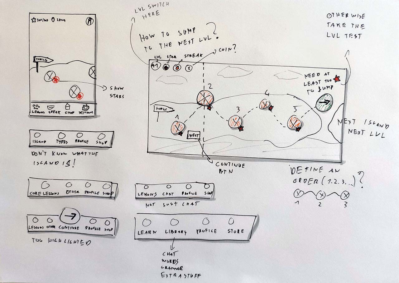
Paper sketches of Xeropan’s new navigation
When we had a good enough concept on paper, I built it in the prototype to find out what our users thought about it. After a couple of iterations, Xeropan’s new navigation was born. As the Android Guidelines say:
“Android users expect your app to look and behave in a way that’s consistent with the platform.”
So, I redesigned the bottom navigation bar which now behaves like those in other Android apps. It shows the users their page location and doesn’t disappear when they tap on it.
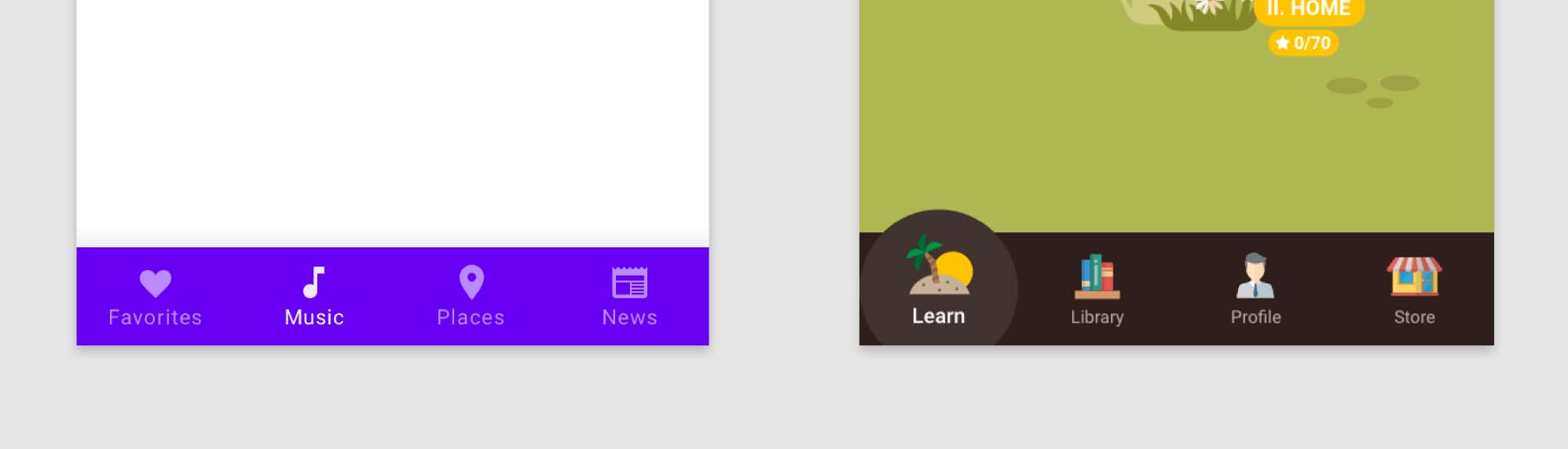
Bottom navigation bars: Standard Android (left) and Xeropan’s redesigned one (right)
Also, with the new copy, people can differentiate the core lessons (Learn tab) from other exercises (Library).
Learn and Library tabs in the redesigned version
3) Accessibility issues
It might sound surprising, but accessibility issues can also affect the retention rate. The following section shows examples of how we fixed some of the problems.
Buttons that didn’t look like buttons
Imagine your users can’t find the main call to action on a page. It could make it difficult or even impossible to use the application, couldn’t it?
Unfortunately, that's exactly what happened when we tested the old version of Xeropan’s Android application. Take a look at these screens:
Lessons list page on the left and lesson overview page on the right (old versions)
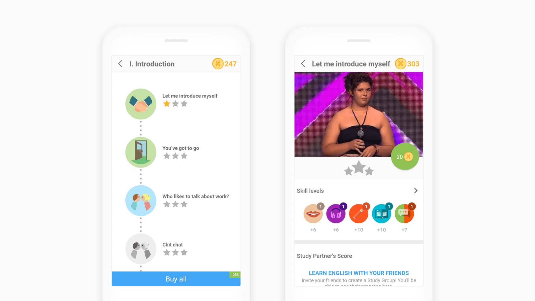
See the “Buy all” button on the first screen? Users took it for an advertisement because it looks exactly like most of the banners on the web. A full-width rectangle with some text, it starts with the word “Buy” and a small label that says “-25%”.
No one understood that this button would unlock all the lessons in this list and cost 25% less than unlocking the lessons individually.
First, I modified the copy and made the button look more like a button. Later, when we completely changed the reward system and removed the coins, I realized this page didn’t need a “Buy all” button any more. So, I could remove it.
Tapping on a lesson on the list page, people would see the page on the right. It should have given an overview of the lesson, skills to learn, study-partners’ scores and more. But how to start the lesson?
Well, some people couldn’t figure it out at all. They looked for a start button, but couldn’t find one. They didn’t understand that it cost 20 coins to buy the lesson and to tap on the green circle to start it. Not surprising, huh?
Since we found that people usually didn’t want to see an overview page like this before starting a lesson, we slightly changed how it works. Tapping on a lesson on the list page now starts it right away.
However, you can still access an overview page by tapping on the info icon in the top right-hand corner of a lesson card.
Take a look at the redesigned lessons list and lesson overview pages below:
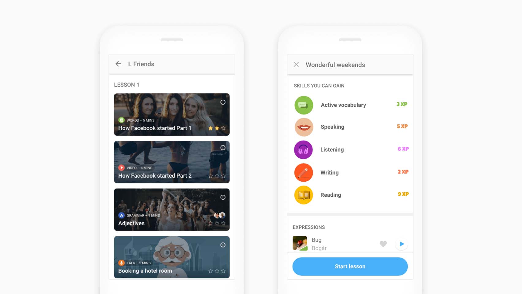
Lessons list on the left and lesson overview page on the right (new versions)
The lessons list page now looks more complex. People wanted to know more about the lesson types, the time needed to solve them, and friends who have already completed the exercises.
Levels that weren’t easy to understand
Another issue we found concerned levels. Let’s say you selected Intermediate level while onboarding. Opening the levels page later showed twelve different levels – two colourful (Basics and Intermediate) and the rest in black and white.
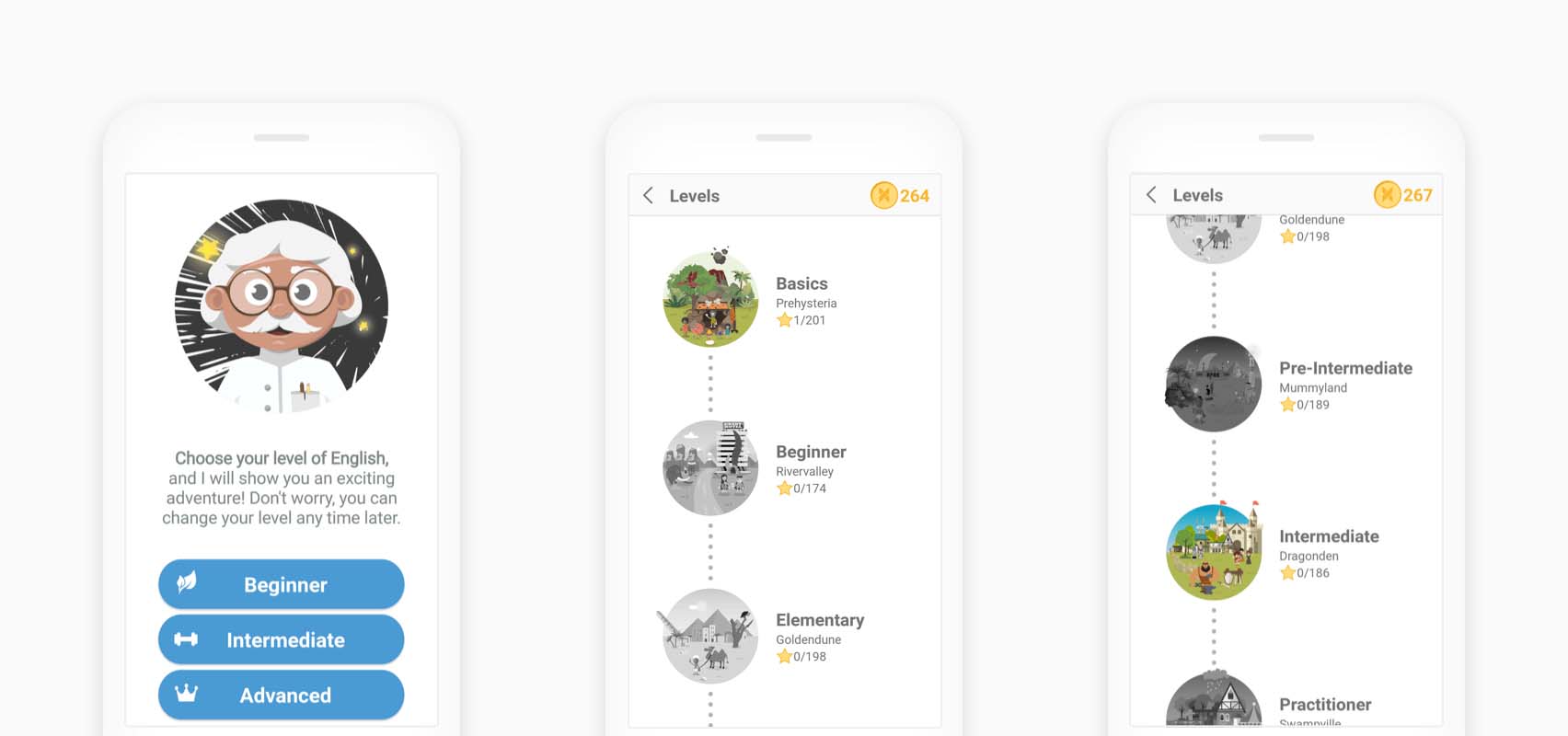
Levels in the old user interface
People got confused and didn’t know why they could only select from three options before. Also, they couldn’t understand which level they had reached since two appeared colourful at the same time.
When they selected Intermediate while onboarding, the system automatically unlocked Basics as well. For some reason, it didn’t make all the levels under Intermediate available (meaning that you could jump to them without having to take a level test), only Basics.
So we changed how it works and redesigned these pages a bit.
In the new version, you can select from all twelve levels in the onboarding flow and selecting a level makes all the lower ones available.
Also, in the redesigned version, users can easily see their level thanks to the blue background and the “Current level” label (which might be a good enough solution for colour-blind people as well.)
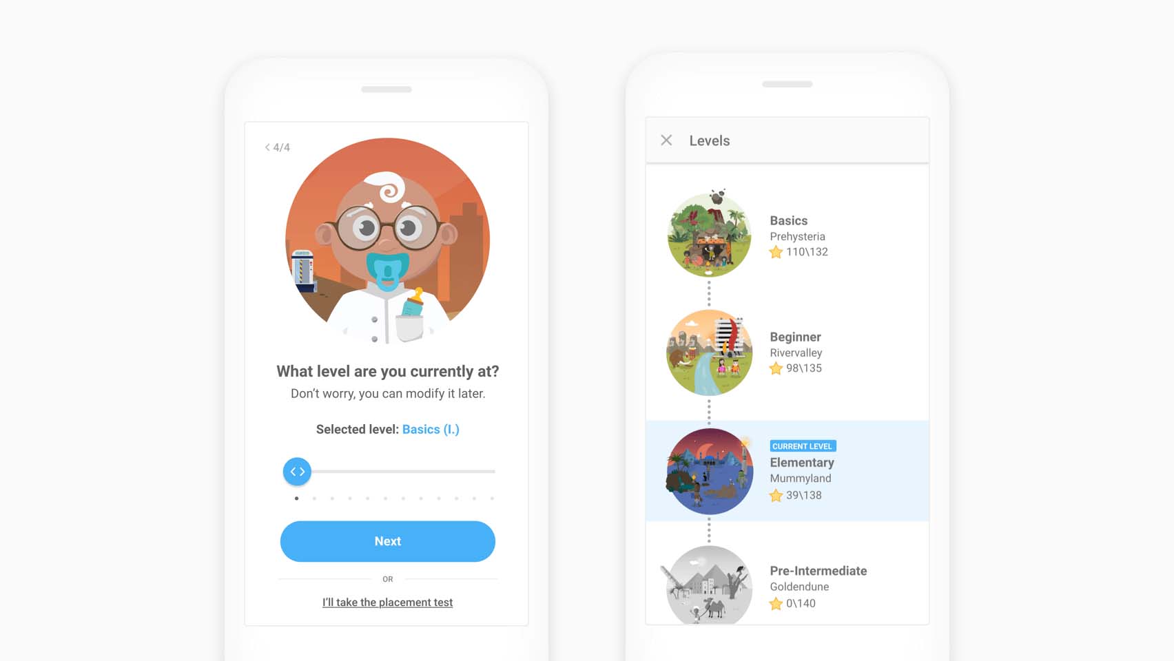
Levels in the new user interface
Takeaways
During the seven weeks of collaboration, I learned a lot about user onboarding and had the chance to test many different solutions. The user tests showed that people found the new version simple, straightforward and easy to understand. Moreover, they really enjoyed using it.
By redesigning the user onboarding flow, changing the navigation and solving the accessibility issues, we managed to solve most of the user problems.
My main takeaways are the following:
Understand the problem. It might sound like a cliché, but you cannot solve a problem if you don’t know what it is.
Test usability. Always test with the target audience because they are going to use the product you’re building.
Consider copywriting the most powerful tool in your toolbox as a UX designer, especially when it comes to user onboarding. Finding the right copy might not come easy but it helps people understand your message.
Using the wrong UI elements can make your product inaccessible. Stick with platform-specific conventions when appropriate.
Thank you for reading!