Design nuggets
A collection of some of the little things I worked on over the years - mainly app concepts, illustrations, challenges and other fun stuff.
Hun-made.com
During the COVID-19 lockdown in early 2020, my one my best friends, Flóra Cselényi, and I launched a website where we showcased some of the greatest Hungarian small businesses that create unique and sustainable arts & crafts.
Supporting small businesses in those challenging times was especially important - and we wanted to make it easier for people by creating a platform where they could find them in one place.
I loved working with Flóra on this project. She was responsible for content and marketing while I was the one who designed and coded the Hun-made website.
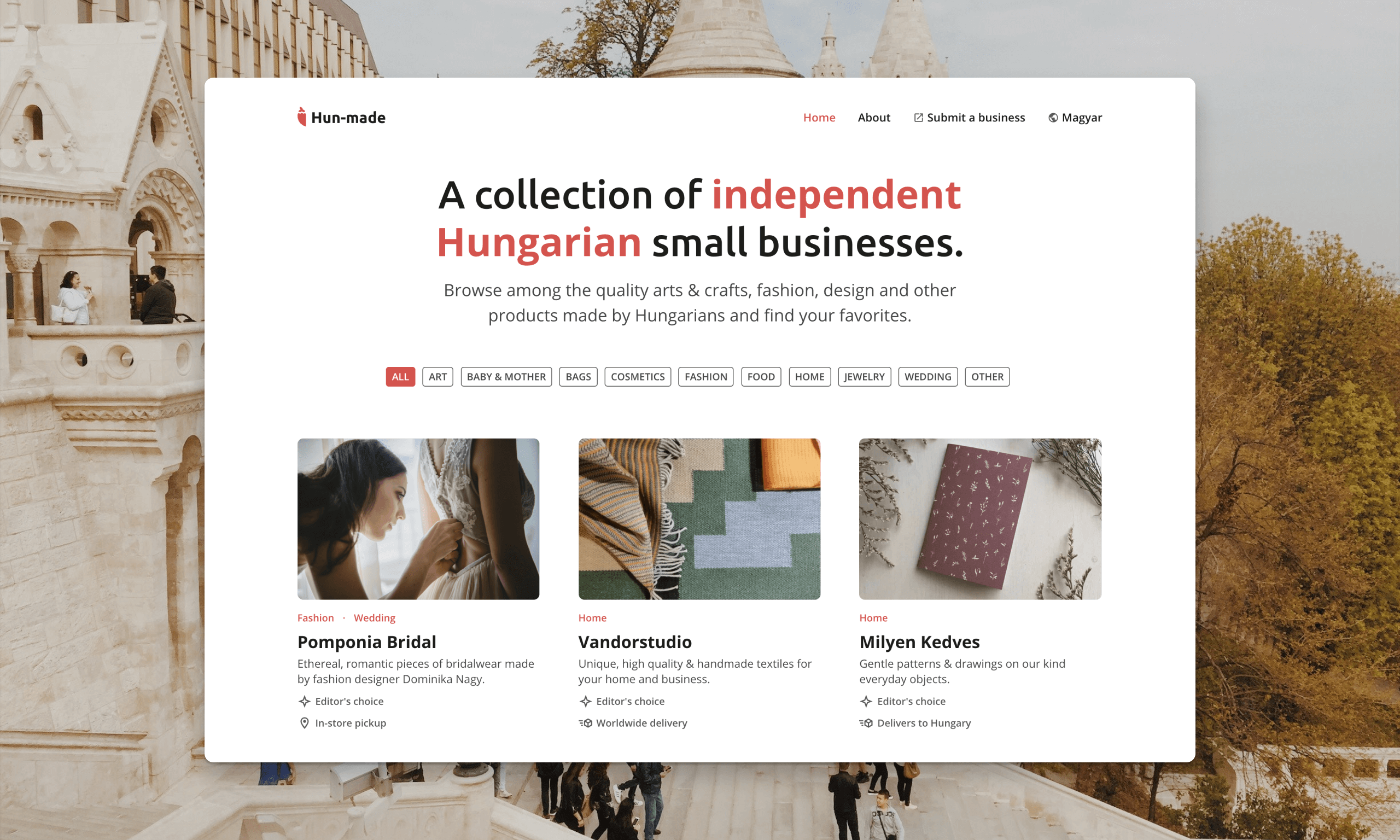
The home page of our website, Hun-made.com
Figma contrast checker
When I started working at Beekeeper, Figma became one of my primary design tools. Generally, I've been really satisfied with it, because in many cases, it makes my life easier. However, I still miss a couple of features that could help designers make their workflows faster and more convenient.
It doesn't provide, for example, a tool for checking color-contrast ratios. That's why I came up with the idea of this additional feature. Something like this could potentially save designers some time and also raise awareness of visual impairment and accessibility in general.
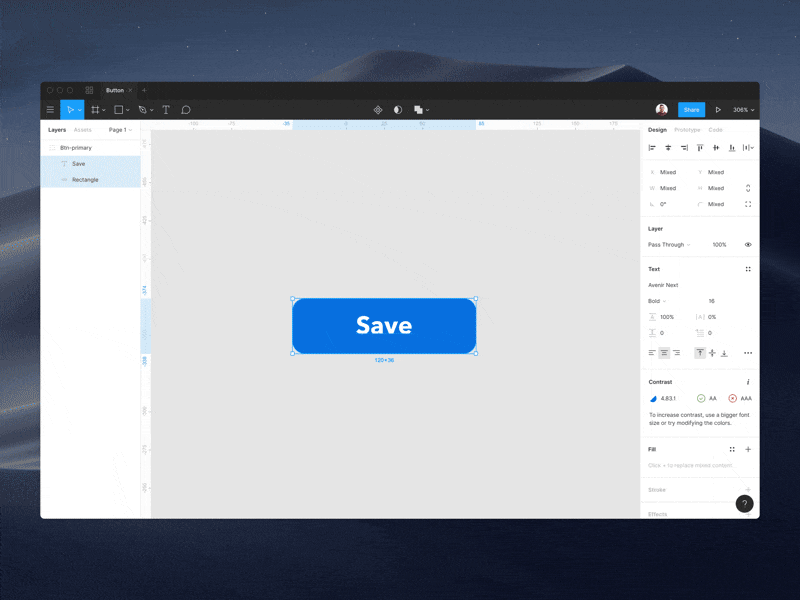
Built-in Figma contrast checker concept
100 Day UI Challenge
Back in 2016 I started the 100 Day UI Design Challenge because I wanted to do some visual exercises to polish my aesthetic skills and become faster, but at the end I realised that I learned much more.
The challenge is about creating a piece of user interface every day for a hundred consecutive days — even at weekends and on holidays. Each day's topic is given by Paul, but everyone is supposed to design something unique that is somehow different from the ones that are created by other participants.
Want to see what I learned from completing this design challenge? Read more about my 100 Day UI Challenge.
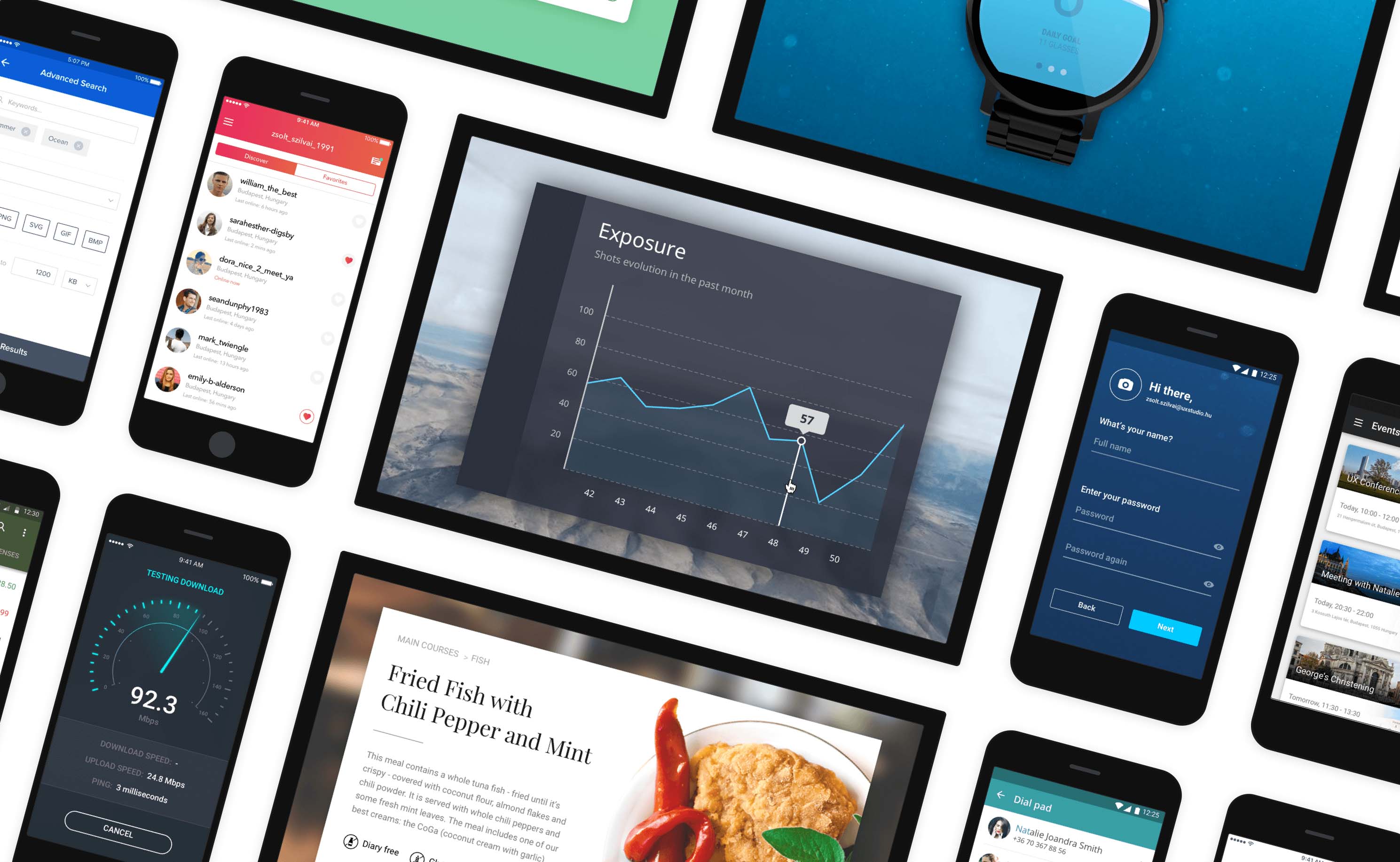
Some of the daily designs I created
Uplabs Material Design Onboarding Challenge
In 2016 Uplabs launched a challenge to design the best Material Design onboarding experience. I found it really exciting so I participated, and eventually got 2nd place.
Since almost all the onboarding flows that I've seen before move horizontally, I decided to come up with a vertical solution. Swiping up may be more natural than swiping from the right to the left, so people might find going through a flow like this more convenient.
People often don't like typical feature onboarding screens, they want to jump right in and discover the app on their own (thus onboarding with empty states is essential). This is why I tried to create something fun and lively. Also, I think simple and straightforward illustrations can help people get the message.
About the concept: this is a make-believe onboarding flow for Marky, a smart voice recorder, that I worked on at UXstudio.
I really enjoyed working on this animation with Principle - using drivers for the first time:) I'll definitely use this feature more often.
You can find the original post and download the Principle file on Uplabs.
Vertical onboarding animation
Material icons Sketch library with color overrides
If you use Sketch and work with design systems you know that changing colors in symbols isn't that easy. At least it wasn't back then in November 2017, when I came up with the idea of creating a library with all the Material icons from Google to make designers' lives a bit easier.
The Sketch file contains icons as symbols with color overrides, so people can easily change their colors.
Black and white colors are available by default, but you can add your own ones on the Colors page. All icons are set to exportable directly on the symbols page, so they will be exportable assets in Zeplin if uploaded.
You can take a closer look at them on Sketchappsources.com or on GitHub.
Changing colors is very easy with this library
Random app concepts
Every now and then I play around different design tools and create new design concepts or add new features to existing products just for fun. I like experimenting and these concepts usually help me explore things and generate new ideas. You can find all of them on my Dribbble page.
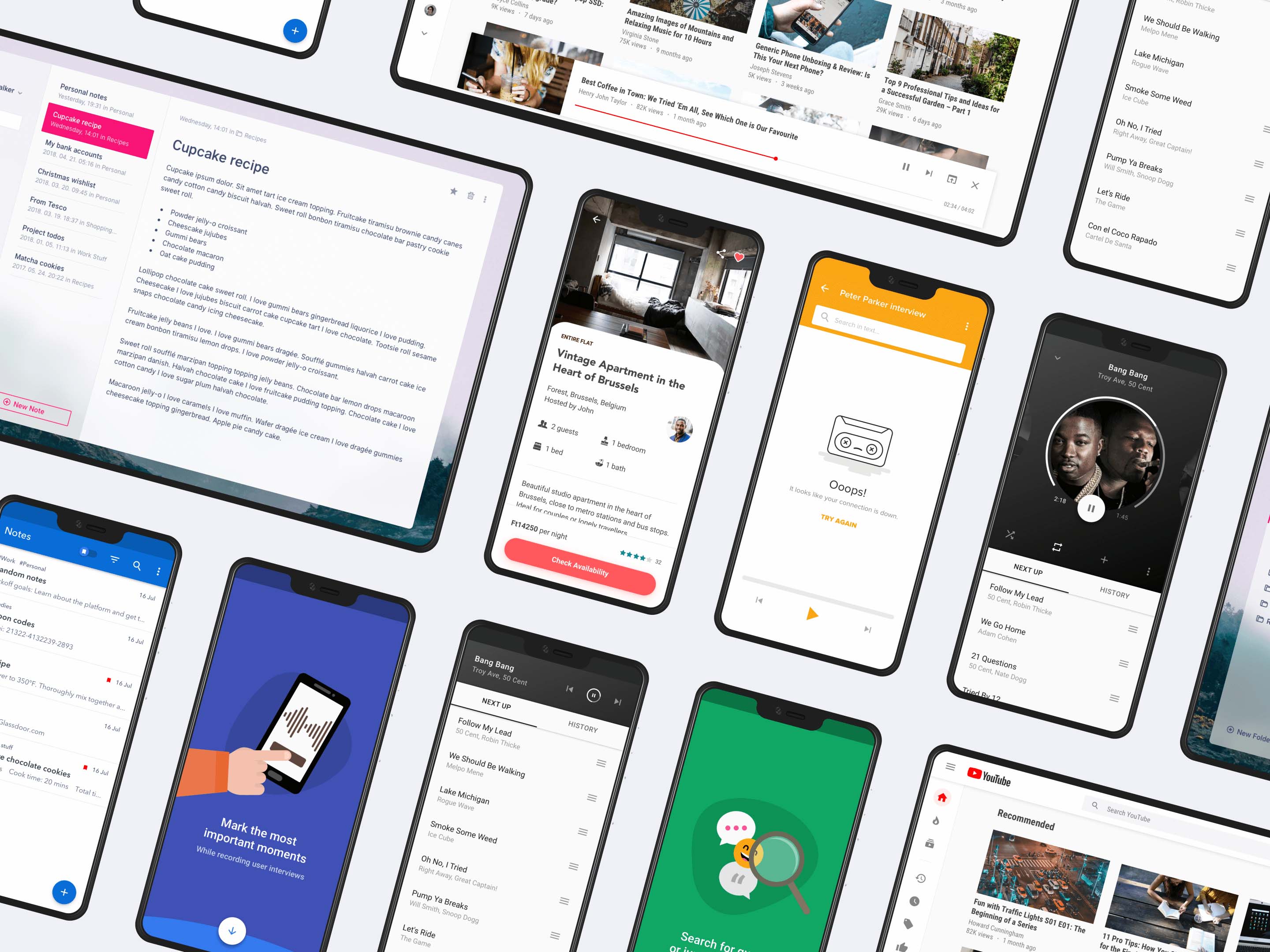
Youtube 2019
With this concept for example I visualised my idea of YouTube bringing the "playing video while browsing" concept to desktop. I love this solution in their mobile apps - both on Android and iOS - and I wonder if they're going to introduce it on desktop, too.
Another thing I modified compared to the original version is the sidebar: I made it similar to the one in the new Gmail 2018. Also, I changed the font to Roboto Condensed - just because I think it's nice:)
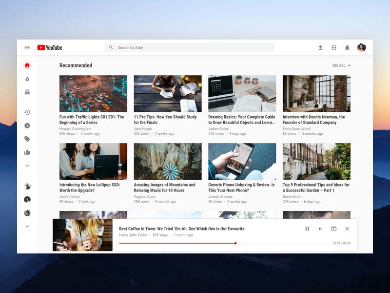
View Youtube redesign concept in full size
Fluent design notepad
I really like fluent design interfaces so I created this simple notepad concept.
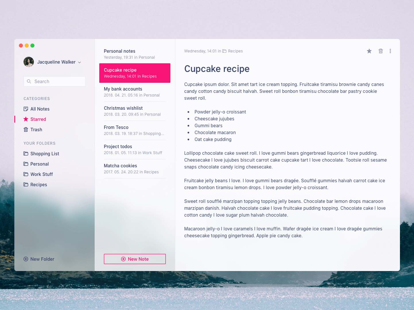
Fluent design notepad concept
Airbnb app concept
I created this one before I visited one of my best friends in Brussels, and I wanted to design something related to that beautiful city. This is an Airbnb mobile app concept for iPhone X - with a materialish look as a twist.
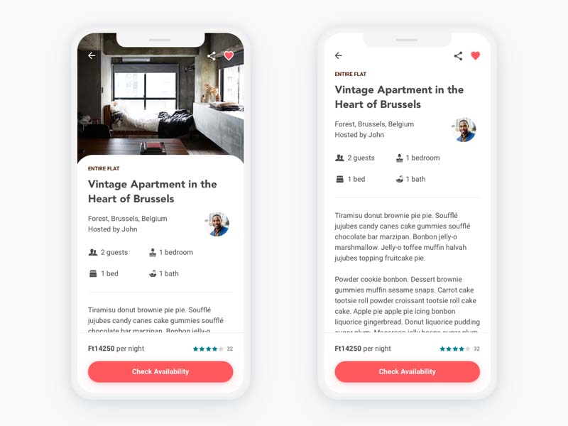
Airbnb app concept on iPhone X
Spotify redesign concept
This is a Spotify mobile app concept I played around with a little. On one hand I wanted to design a circular progress bar that gives the feeling of a physical vinyl record player, and on the other hand it would be nice to modify my playlist right on the music player screen.
This concept would let you swipe up to see the rest of the playlist panel, where you could easily reorganise the sequence of items or switch to another song.
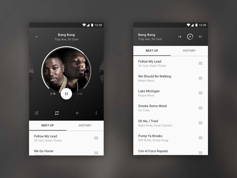
Spotify redesign concept with a circular progress bar
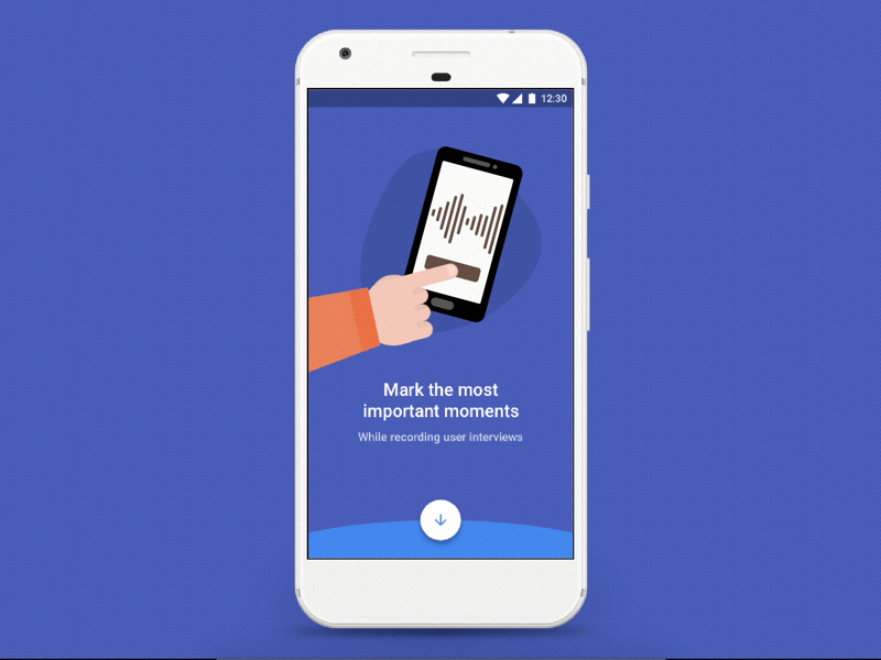
Marky Voice Recorder empty & error states
In 2016 we came up with the idea of creating Marky Voice Recorder, our first own product at UXstudio. With Marky interviewers can not only record conversations but also mark the most important moments during interviews and get instant transcripts – saving them time and energy.
I was between two projects, so I had the chance to work on Marky for a week or two. During this time I designed some screens, including the empty & error states. I really enjoyed working on these illustrations, especially because I'm not great at drawing, and I could improve my skills a bit.
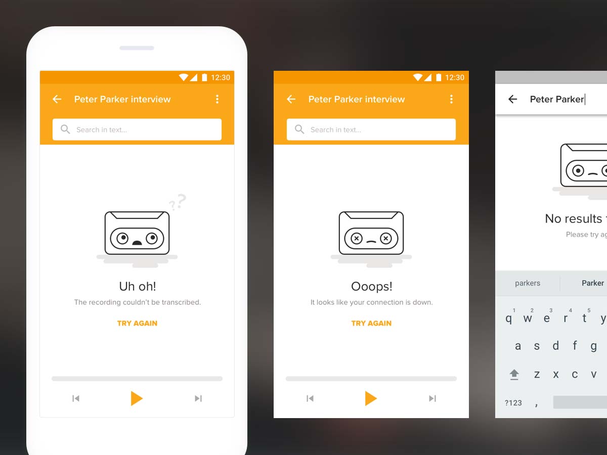
Marky Voice Recorder empty & error states
Thank you for reading!